Sefar Components
Components #
Shop Card v1.1.0 #
The Shop Card component consists of multiple elements :
- Implemented vertical alignment for card tags.
- Added SefarTag type for SideElements.
- Implemented placeholder image for card.
- Updated ‘ShopCardDetails’ to take TagStyle, tagAlignment and placeholder image as parameter instead of fixed values.
Below images show LTR and RTL variations of the shop card.
Accordion v1.0.1 #
The Accordion has 2 different states: Expanded & Collapsed.
Regarding its structure, the Accordion consists of the following elements:
- Header icon (Optional)
- Header text
- Body text (Optional)
- Custom component (Optional)- Nested instance: Slot (can be changed with any other components)
Below you can see the images representing different states of the accordion in LTR and RTL
Avatar v1.3.0 #
We have 3 types of avatars:
- Image Avatar
- Icon Avatar
- Initials Avatar: It can have one or two initials
Each can accept a badge, and it should be either an OnlineIndicator or a VerifiedBadge. They also can have two diffirent states: Elevated and Focused.
The Avatar component can come in 4 sizes:
- Extra Small
- Small
- Medium
- Large
In the image below you can see different types of Avatars with different sizes, badges and states.
Avatar Group v1.1.1 #
The Avatar Group component is used to display a group of avatars in a single container. It can be used to represent a group of users, contacts, or participants in a conversation. The component supports the following features:
    - Avatar size: The component supports four sizes: extra small, small, and medium.
    - Maximum number of avatars: The component can display up to eight avatars.
    - RTL support: The component supports right-to-left (RTL) languages.
Backdrop v2.3.0 #
The Backdrop component is available in 3 main types:
- EmptyState
- CustomState
- ListItemState
The Illustrations in Empty State support the following:
- Carousel: if we have more than one illustration in the illustrations list.
- One illustrations: one illustrations in the illustrations list.
We have 2 types in Carousel Indicator type in Empty State as the following:
- Dot
- Line
Each type of Carousel Indicator in Empty State has three sizes:
- Small
- Medium
- Large
The ListItemState support the following:
- userScrollEnabled Flag to enable or disable user scrolling. Defaults to true.
- showScrollbar Flag to show or hide the scrollbar. Defaults to false.
In CustomState Backdrop optionally you can have an IncrementButton.
The other optional params for all types:
- backdropHeaderItem Optional header item containing title, subtitle, and tab information
- isVisible Flag to indicate whether the backdrop is visible
- screenState to indicate if the screen state should be displayed in full screen or Contained
- isSecondaryButtonNegative Flag to indicate if the secondary action button is negative style.
- primaryAction CTA
- secondaryAction CTA
- tertiaryAction CTA
Badge v1.0.2 #
Badge is used to indicate something in the design. It is used in the Tabs Component. Badge is represented in two different states:
- With Text
- With Dot
Depending on the color it can also be in different styles, such as in the image below. Each color is responding to each style:
- Negative
- Contrast
- Primary
- Secondary
- Warning
- Positive
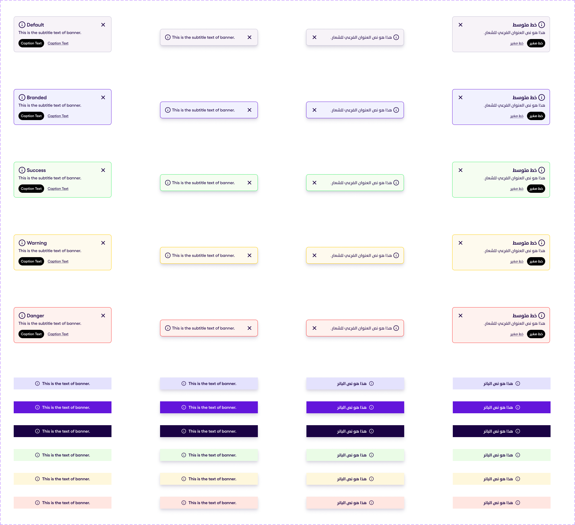
Banner v1.1.2 #
Banners are presented in two different types:
- Boxed
- FullWidth
Boxed banner consists of the next elements, every one of which are optional
- Leading Icon
- Label
- Trailing Icon
- Body text
- Primary Action
- Secondary Action
Both Boxed and FullWidth banned can be or elevated or not. But with Boxed Banner when the elevation is on the available components of the Boxed Banner are
- Leading Icon
- Subtitle
- Trailing icon
FullWidth banner has the following elements:
- Leading Icon
- Label
Boxed Banner can have the following styles:
- Default
- Branded
- Secondary
- Positive (Success)
- Negative (Danger)
- Warning
- Informative
Full Width Banner can have the following styles:
- Default
- Branded
- Secondary
- Alternative
- Positive (Success)
- Negative (Danger)
- Warning
- Informative
The image below shows the Banner variations.
Bottom Navigation Bar v2.0.0 #
The BottomNavigationBar is a customizable component that provides a bottom navigation menu for apps. It allows users to navigate between different sections of the app using icons and labels. Each item of the BottomNavigationBar can have:
- Icon
- Text
- Badge
A Badge can eather be a dot badge(indicating available updates) or a text badge to show the number of the avalable updates.
Buttons #
Floating Action Buttons v1.0.1 #
Floating Action Buttons (FABs) have only 2 states: Active and Deactive. The following demonstrates both states in RTL and LTR Directions.
Note: Label is an optional property.
Icon Buttons v1.3.0 #
Icon Buttons have the following types (which will be illustrated below): Primary, Branded, Secondary, Textual, and Negative.
Note that all the following buttons come in 2 styles: Flat (no shadow), Floating (has a shadow). The Flat style uses all 4 sizes: Small, Medium, Large, Extra Large. The Floating size only uses 3 sizes: Medium, Large, Extra Large.
Each row of buttons in the coming sections of Icon buttons represents a distinct state:
- Row 1 : This row showcases the buttons in state: Default.
- Row 2 : This row showcases the buttons in state: Hover.
- Row 3 : This row showcases the buttons in state: Focus.
- Row 4 : This row showcases the buttons in state: Disabled.
Primary Icon Buttons #
Branded Icon Buttons #
Secondary Icon Buttons #
Textual Icon Buttons #
Negative Icon Buttons #
Increment Buttons v1.2.0 #
The following illustration depicts increment buttons in all their available states and visual styles.
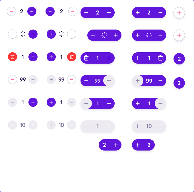
Each row represents a distinct state:
- Row 1 : This row showcases the buttons in state: Default.
- Row 2 : This row showcases the buttons in state: Loading.
- Row 3 : This row showcases the buttons in state: With Trash.
- Row 4 : This row showcases the buttons in state: Maximum.
- Row 5 : This row showcases the buttons in state: Minimum.
- Row 6 : This row showcases the buttons in state: Disabled.
- Row 7 : This row showcases the buttons in state: AddOnly

The last 2 elements in the first and second rows are in state: Default but without any data

The last 2 elements in the third and fourth rows have a state: Collapsed.
Each column represents a combination between style and direction:
- Column 1 : This column showcases the buttons in style: Default and LTR direction.
- Column 2 : This column showcases the buttons in style: Default and RTL direction.
- Column 3 : This column showcases the buttons in style: Floating and LTR direction.
- Column 4 : This column showcases the buttons in style: Floating and RTL direction.
Text Buttons v1.2.0 #
Text Buttons have the following types (which will be illustrated below):
- Primary,
- Branded
- Secondary
- Textual
- Negative
Note that Text buttons come in 3 different sizes:
- Small
- Medium
- Large
In the below sections you will be able to see the different sizes of the buttons with text in LTR and RTL.

Cards #
Activity Card v1.0.0 #
Activity Card Component consists of 3 parts:
- List Item
- Body
- Actions
List Item is represented with:
- Title,
- Transaction Status,
- Transaction Date,
- Leading Icon
- Balance.
There is no avaiaibity to add more elements or change them

Body of the Activity Card is represented by:
- Text
- Address List
Actions is represented as:
- Secondary Button
- 2 Secondary Buttons
- Label with a Tag

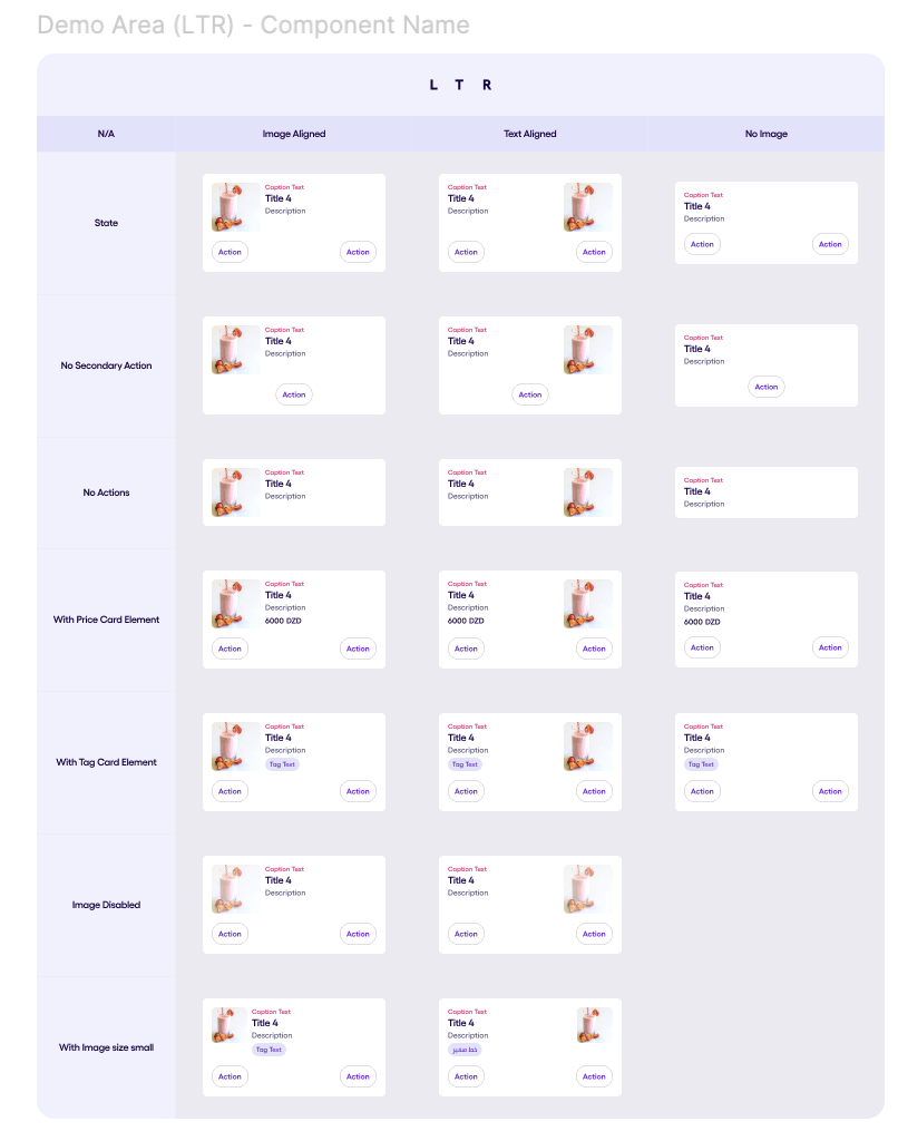
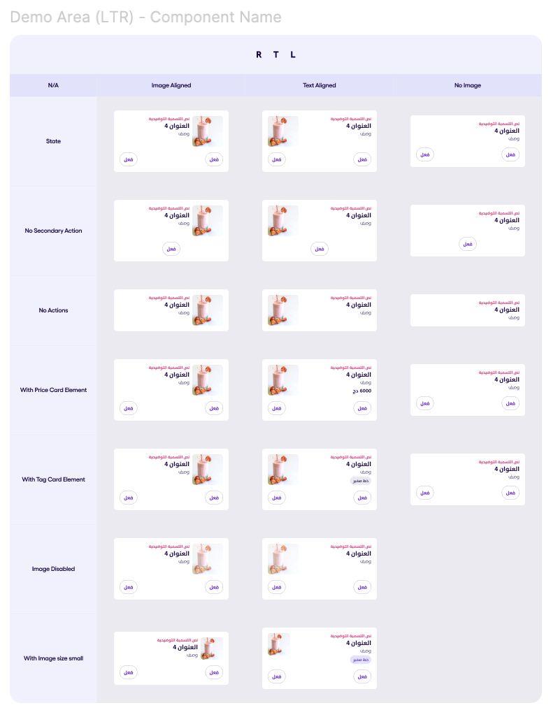
Horizontal Card v1.1.0 #
The Horizontal Card component consists of multiple elements :
- Titled Section: Titled (Required)
- Image: Image (Optional)
- Card Elements (Either Price component or || Tag component  / Optional) : SubElement (Optional)
- primary: ActionButton (Optional)
- secondary: ActionButton (Optional)
- primary2: ActionButton (Optional)
The Card image has two possible sizes :
- Large
- Small
- type: ProgressBarType (Optional)
- size: ProgressBarSize (Optional)
- hasLabel: Boolean (Optional)
The horizontal card with the image has two possible layouts :
- Image Aligned Card
- Text Aligned Card
The Horizontal Card can have different secondary action types :
- Button
- Icon Button
- Increment Button
Below you can see the images representing different states of the horizontalCard in LTR and RTL
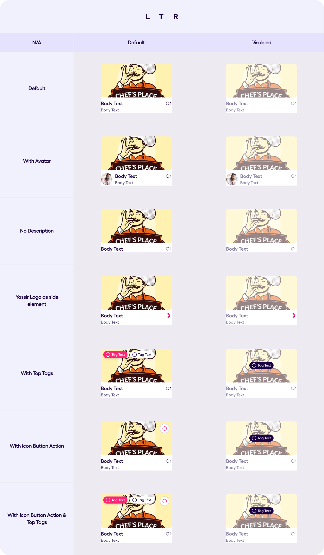
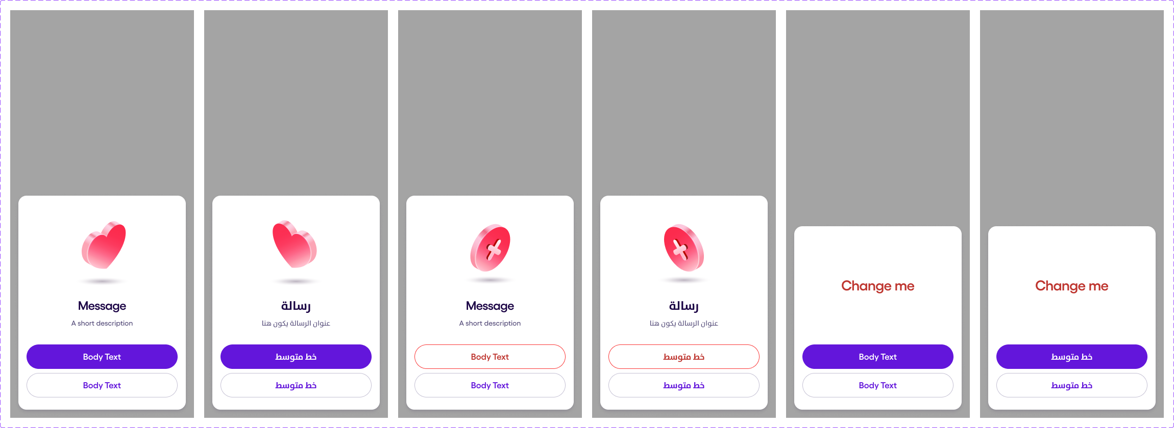
Shop Card v1.0.0 #
The Shop Card component consists of multiple elements :
- Shop Card Title (has a maximum of two lines, behaviour of the text can be overrided)
- Card Description (Optional)
- Card Element (An icon with a label or Yassir Icon logo, horizontally aligned with the title)
- Avatar ( Aligned horizontally with Title & Description / Optional )
The Shop Card component’s image can have multiple variants :
- Image with no Actions
- Image with Icon Button
- Image with Shop Tags
- Image with Shop Tags & Icon Button
The Shop Card component can be disabled as well, in that case, we should display a centered tag instead of the Actions. All text layers should have “Label/Neutral/Disabled” color instead of “Label/Neutral/Default“ in the disabled state.
The Shop Card body can display an optional Avatar.
The Shop Card side element can also be a Yassir icon logo.
Below images show LTR and RTL variations of the shop card.

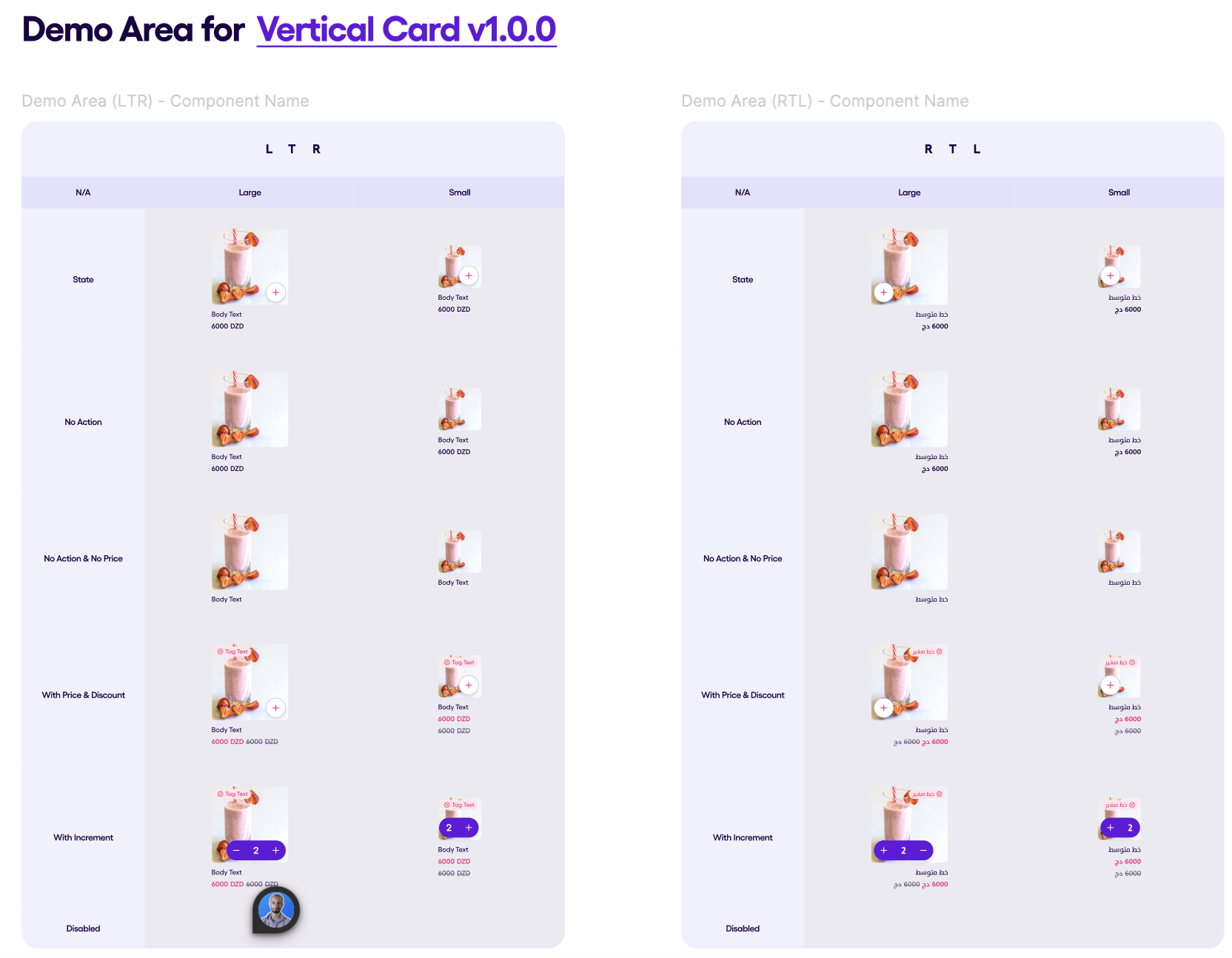
Vertical Card v1.0.0 #
The Vertical Card component consists of multiple elements :
- title: String (Required)
- Image: Image (Optional)
- priceElement : SubElement.PriceElement (Optional)
- tagElement: SubElement.TagElement(Optional)
- action: SecondaryAction.IncrementButton (Optional)
The Vertical Card component has two possible sizes :
- Large (156px of width that can be overrided)
- Small (88px of width)
The Vertical card should have :
- Large increment variant on the large size
- Small (Add only) variant of the small size
Below you can see the images representing different states of the vertical card in LTR and RTL
Charts #
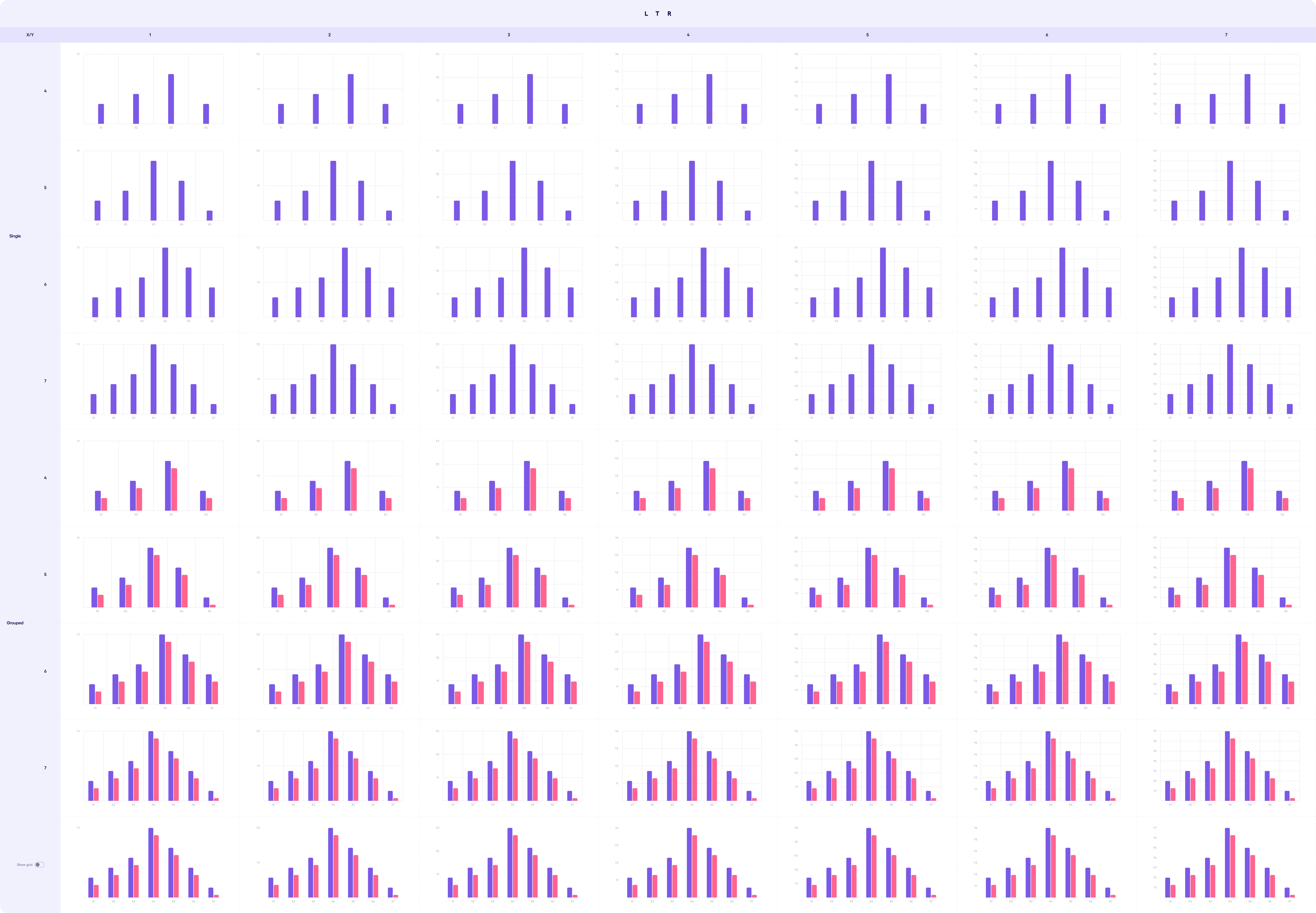
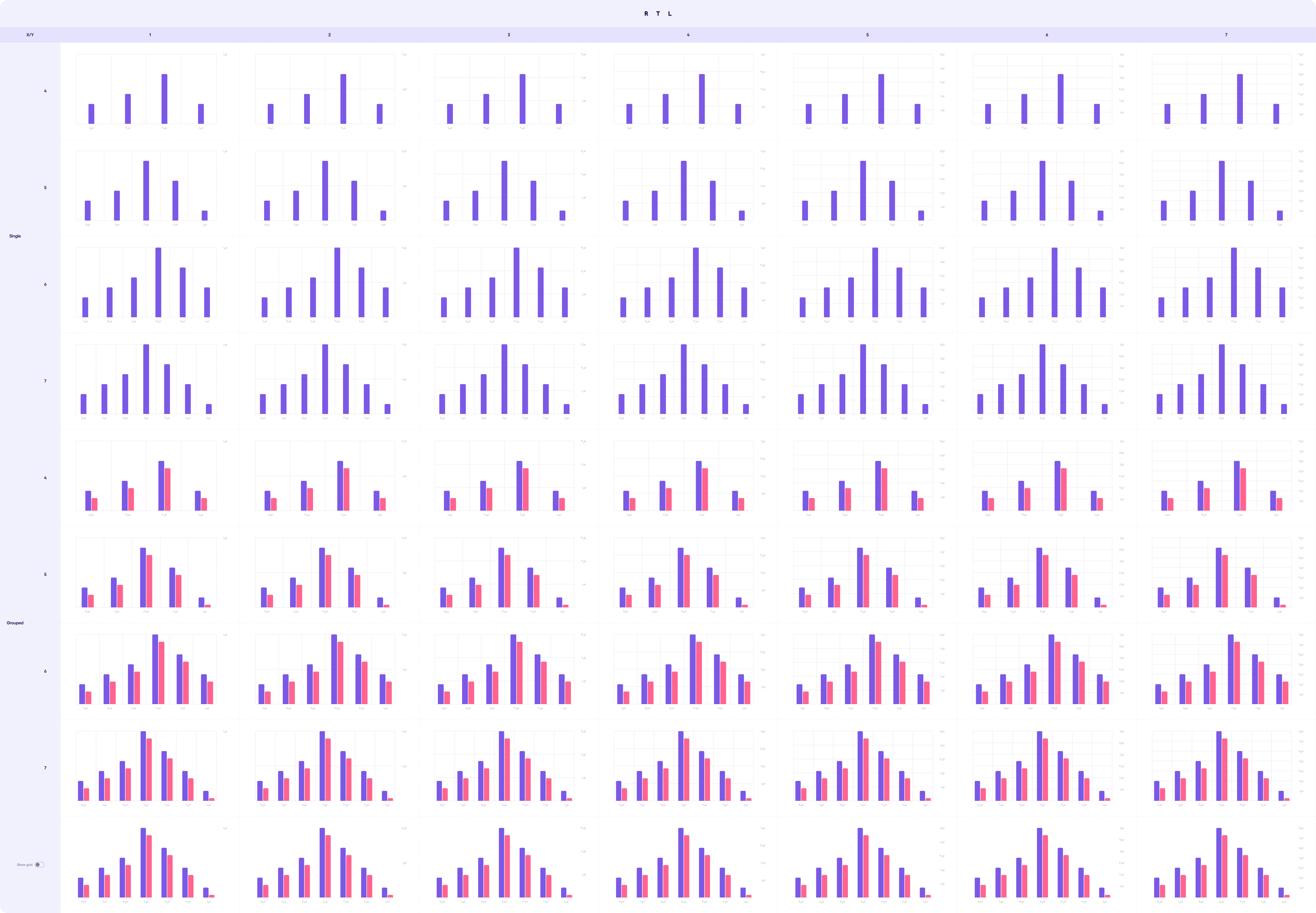
Bar Chart v1.1.1 #
Overview: The Bar Chart component will display a vertical bar chart with configurable bars and grouping. The chart should be responsive and allow for customization of labels and grid visibility.
Bars Limitation: Component only allows up to 2 datasets which translates to a maximum of 2 bars per grid column
The component allows showing or hiding the grid lines in the background. X-Axis and Y-Axis Labels: The X-Axis and Y-axis can have between 1 to 7 labels to represent the data range.
Notes on Behavior: • When a y-value is 0 for any (x, y) pair, a bar will still be rendered with a minimum height to ensure visibility. • If a y-value exceeds the highest y-value on the chart, the bar’s height will be capped at the maximum height of the chart.
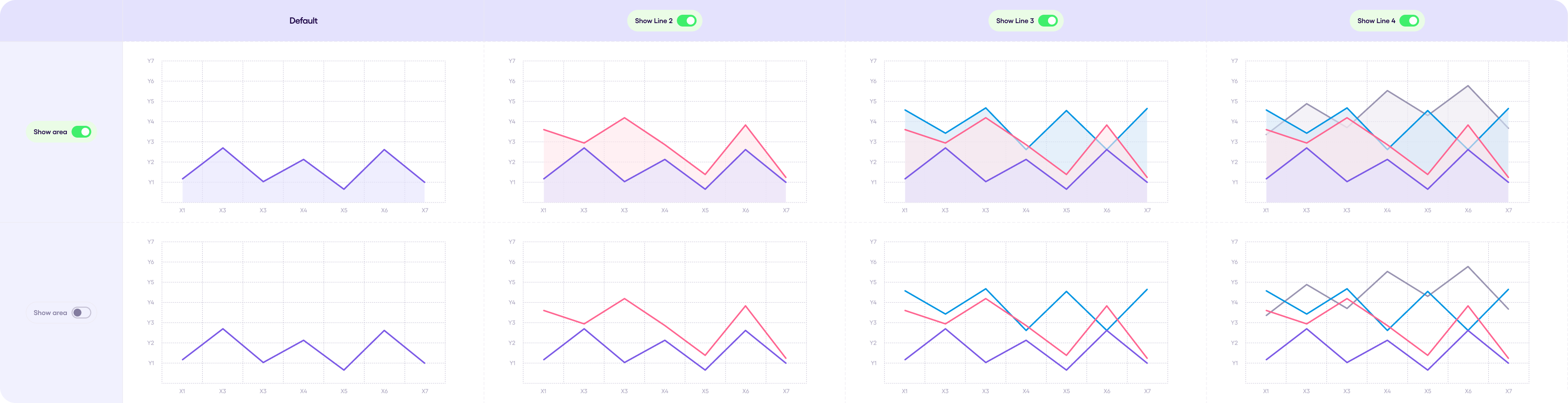
Line Chart v1.1.0 #
Overview: The Line Chart component is a visualization tool that uses lines to represent data points over time or across categories. It allows users to identify trends, compare multiple datasets, and analyze changes in data.
Usage:
-
Use line charts to visualize continuous data that changes over time or across categories.
-
Line charts are effective for showing trends, relationships between variables, and the rate of change.
Limitations:
- Line Chart allows up to 8 datasets only (8 lines)
- Line Chart allows up to 10 x-axis and 10 y-axis points
Dos and Don’ts:
- Do:
Label axes clearly and concisely using appropriate units for the data. Use colors that are visually distinct and accessible for all users. Limit the number of lines to avoid cluttering the chart and making it difficult to read.
- Don’t:
Use excessive gridlines or decorations that distract from the data. Present too much data in a single chart, making it overwhelming for users. Rely solely on color to differentiate lines, as some users might have color blindness.
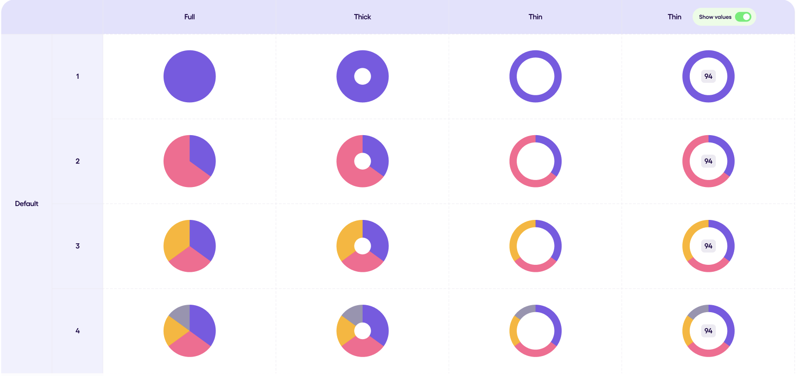
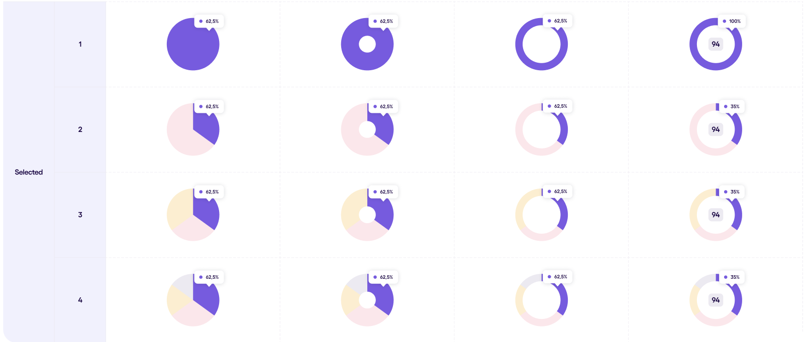
Pie Chart v1.0.0 #
-
Overview: The Pie/Donut Chart component is a circular visualization tool used to represent proportions of a whole. It allows users to understand the relative size of different categories within a dataset.
-
Usage:
- Use pie/donut charts to visualize categorical data where one category represents the whole and the other segments represent portions of that whole.
- Pie charts are effective for displaying a limited number of categories (typically 4 or less) and emphasizing the largest category. Donut charts can be useful when you want to focus on the relationship between data points and the overall total.
- Anatomy:
- Slices: Colored sections representing each category in the dataset.
- Values (Optional): Numbers displayed within the slices (only available for thin style).
- Tooltip (Optional): Overlay that appears on hover, displaying data point information.
- Variants:
Style:
- Full (Pie): Pie chart highlighting the overall data. Doesn’t display values.
- Thick: Pie chart with a thicker slice for better emphasis. Doesn’t display values.
- Thin: Pie chart with a thin slice. Displays values between the slices.
- States:
- Default: Standard appearance of the chart.
- Selected (Thin style only): Highlights a specific data point (slice), disabling interaction with other slices and potentially filtering displayed values.
Chips #
The Chip component is a small, versatile element used to represent small pieces of information or actions. It can display text, icons, avatars, and provide functionality like filtering and selection.
Anatomy: - Text: The primary content displayed within the chip, typically a label or short description. - Icon (Optional): An icon displayed at the beginning of the chip (applicable to “Icon Chip” type only). - Avatar (Optional): An image representing an entity (applicable to “Avatar Chip” type only). - Delete/Close Icon (Optional): An icon used to remove the chip (e.g., used for filter selections). - Background: The colored background of the chip, which can vary depending on the state.
Chips can be used in 3 different forms which will be demonstrated below: Single Chip, Chips Filter, Chips Group.

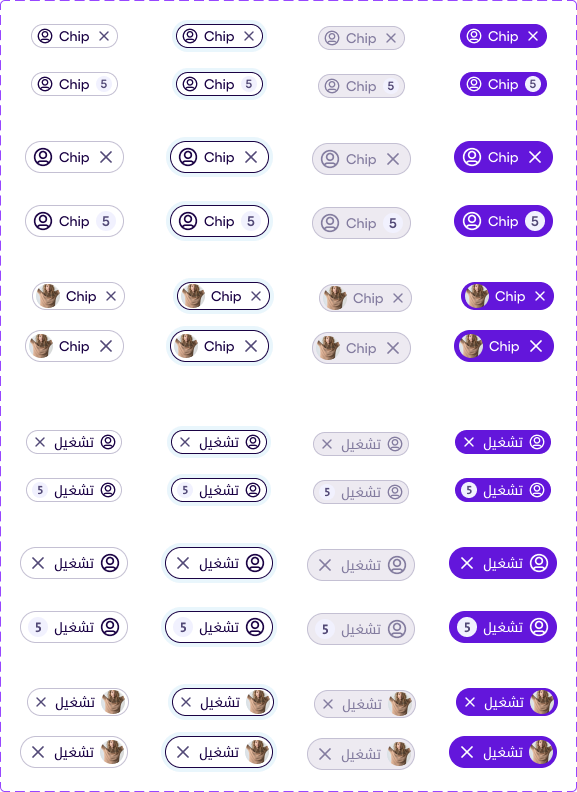
Chips v1.2.0 #
The image below shows the variants of the chip components one of which can have a leading icon and another avatar, note that for the former the leading icon is optional. For the Regular Chip (which can have a leading icon) there are 3 choices for a trailing icon which can be a clear icon, a count holder or neither. However, for the Avatar Chip it can only has an optional trailing clear icon.
There are 4 states for all of the chip kinds:
- Default,
- Focused,
- Selected,
- Disabled
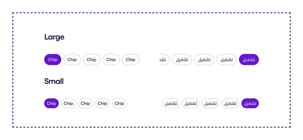
and only 2 sizes:
- Small
- Large
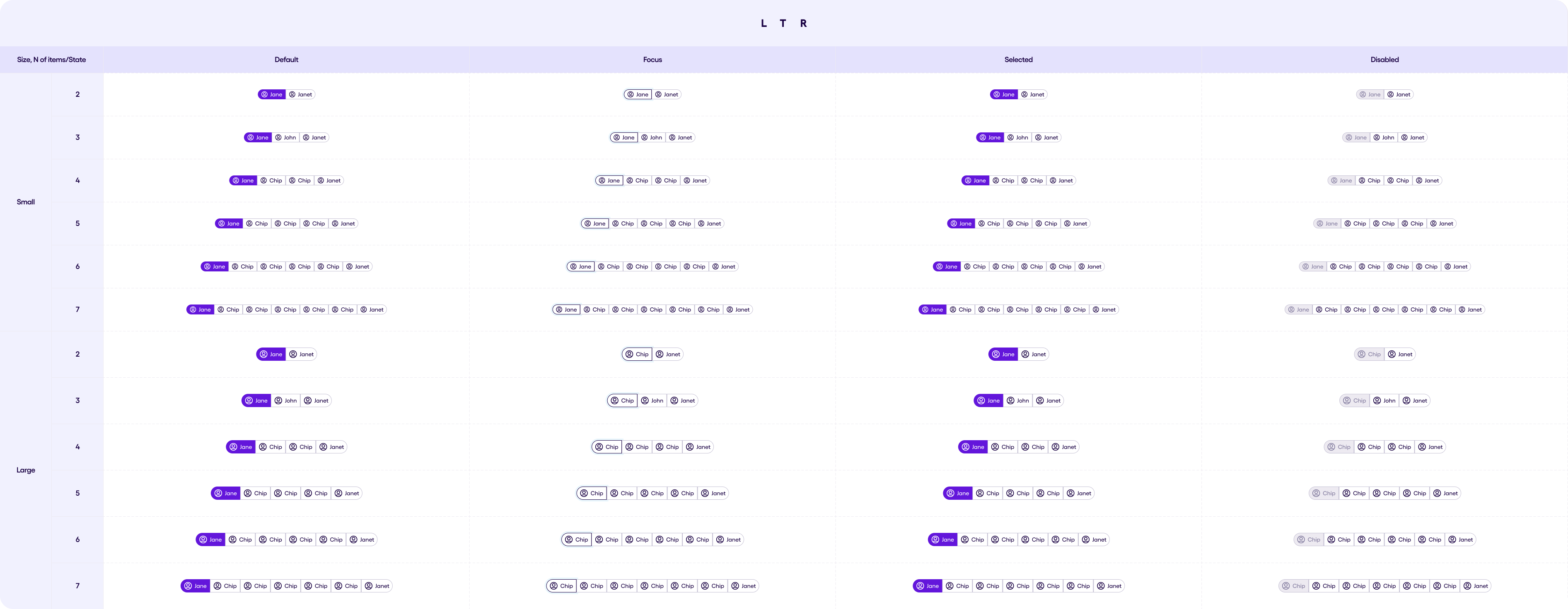
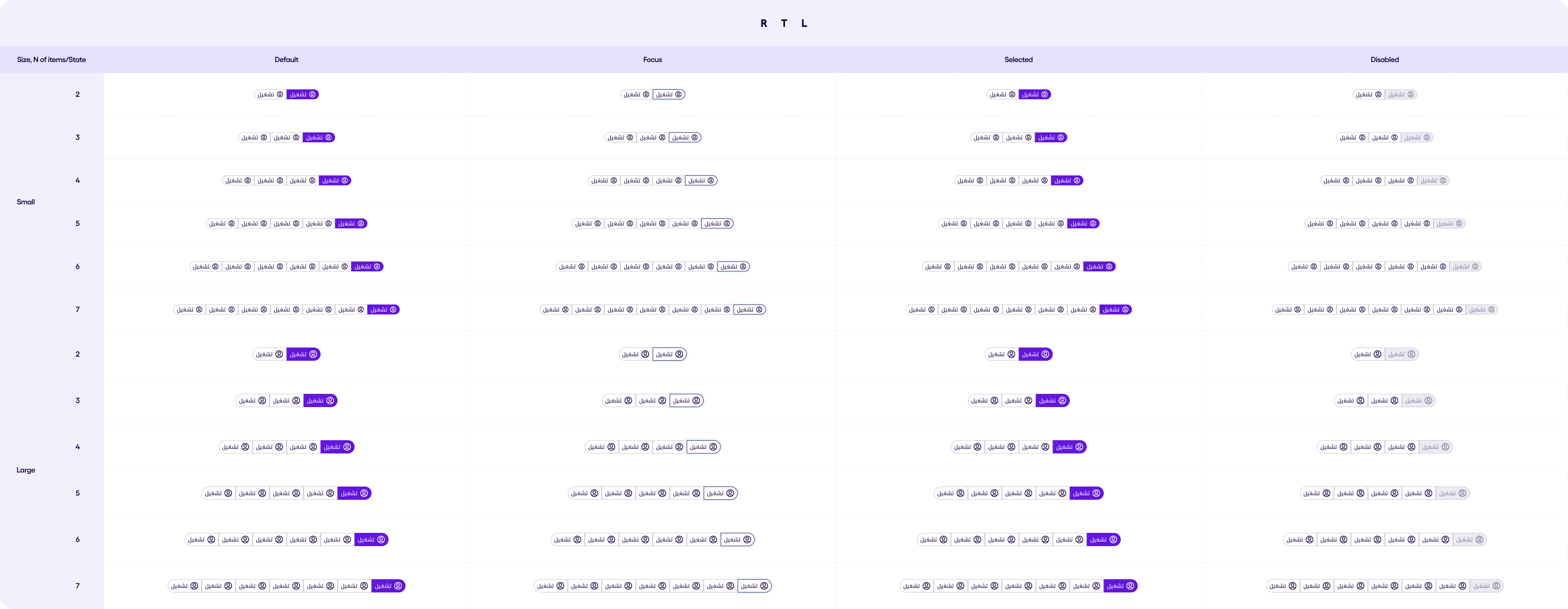
Chip Filter v1.1.0 #
Chip Filter are ideal when you want to allow single of multiple selection from a group of chips, it can also be displayed as a horizontally scrolling row or wrapped to fit the screen width.
Chip Group v1.1.0 #
A Chip Group might look similar to Chip Filter but it only allows single selection, and beyond that, it has the same characteristics. Below you can view the Chip Group in LTR and RTL.
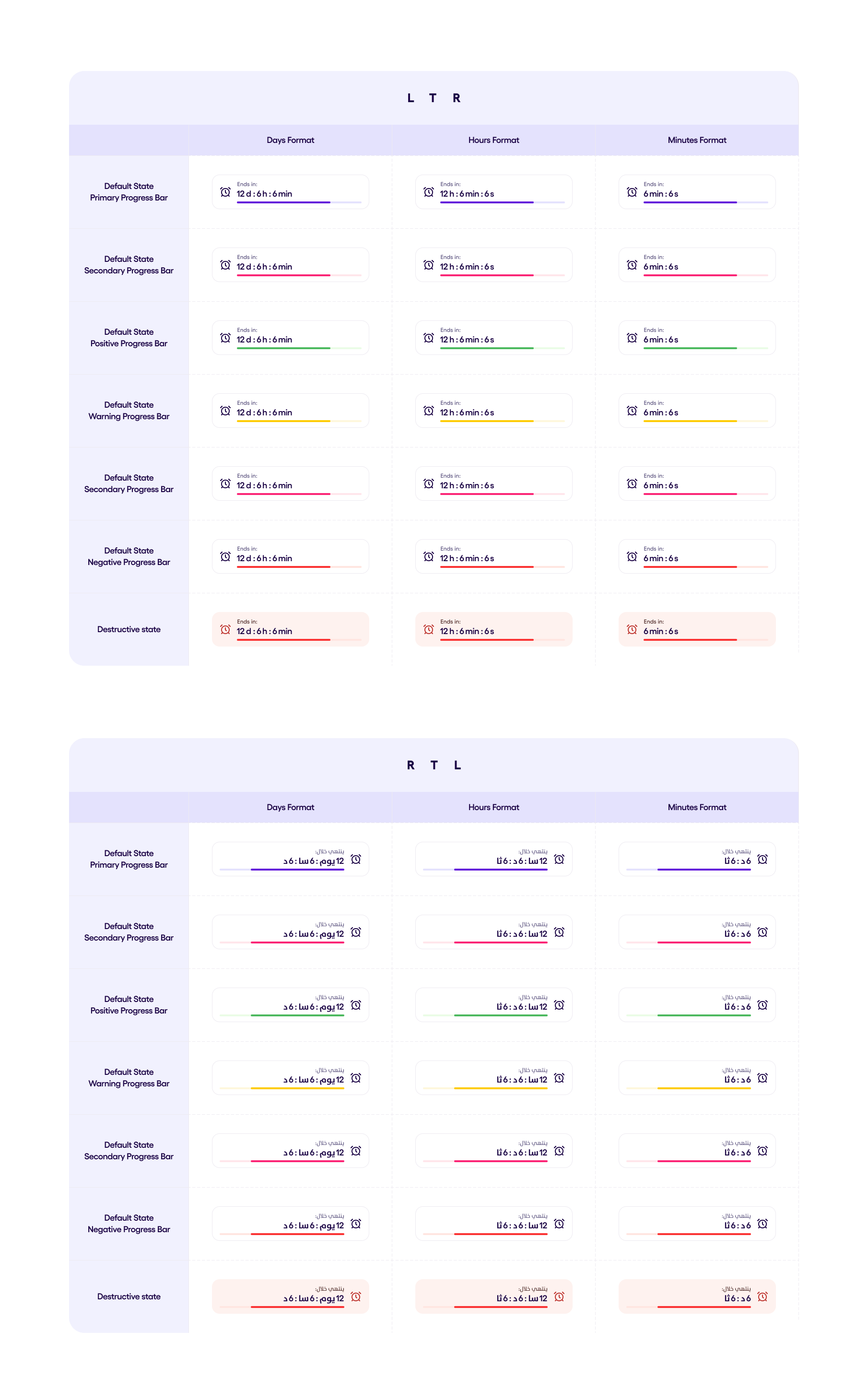
CountDown v1.0.0 #
A countdown timer with a progress bar. The countdown has three formats:
- Days format: timer is displayed in the format dd:hh:mm
- Hours format: timer is displayed in the format hh:mm:ss
- Minutes format: timer is displayed in the format mm:ss
The progressBar of this countdown can have same styles as the regular
ProgressBar. The CountDown can have a normal state and a destructive cooldown state.
Date & Time Pickers #
Date Picker v1.1.1 #
The Date Picker component is an interactive element used for selecting dates or ranges of dates within the SEFAR Design System.
Variants:
Type Options:
• Single day: Allows the selection of only one day.
• Scrollable single day: Only the “Select day” option is available; months are scrollable, and the top bar is non-interactive.
• Range day: Enables the selection of a range of dates.
• Scrollable range day: Similar to “Range day” but with scrollable months and a non-interactive top bar.
• Multiple days: Allows selection of more than one date.
Options (Boolean):
• Time Option (Boolean): When enabled, displays a time selection modal for Single day and Scrollable single day types.
• Selected Days Chips Option: Specifically for the Multiple days type, this controls whether selected days are highlighted.
• Actions (Boolean): Toggles the display of calendar action buttons (primary and secondary).
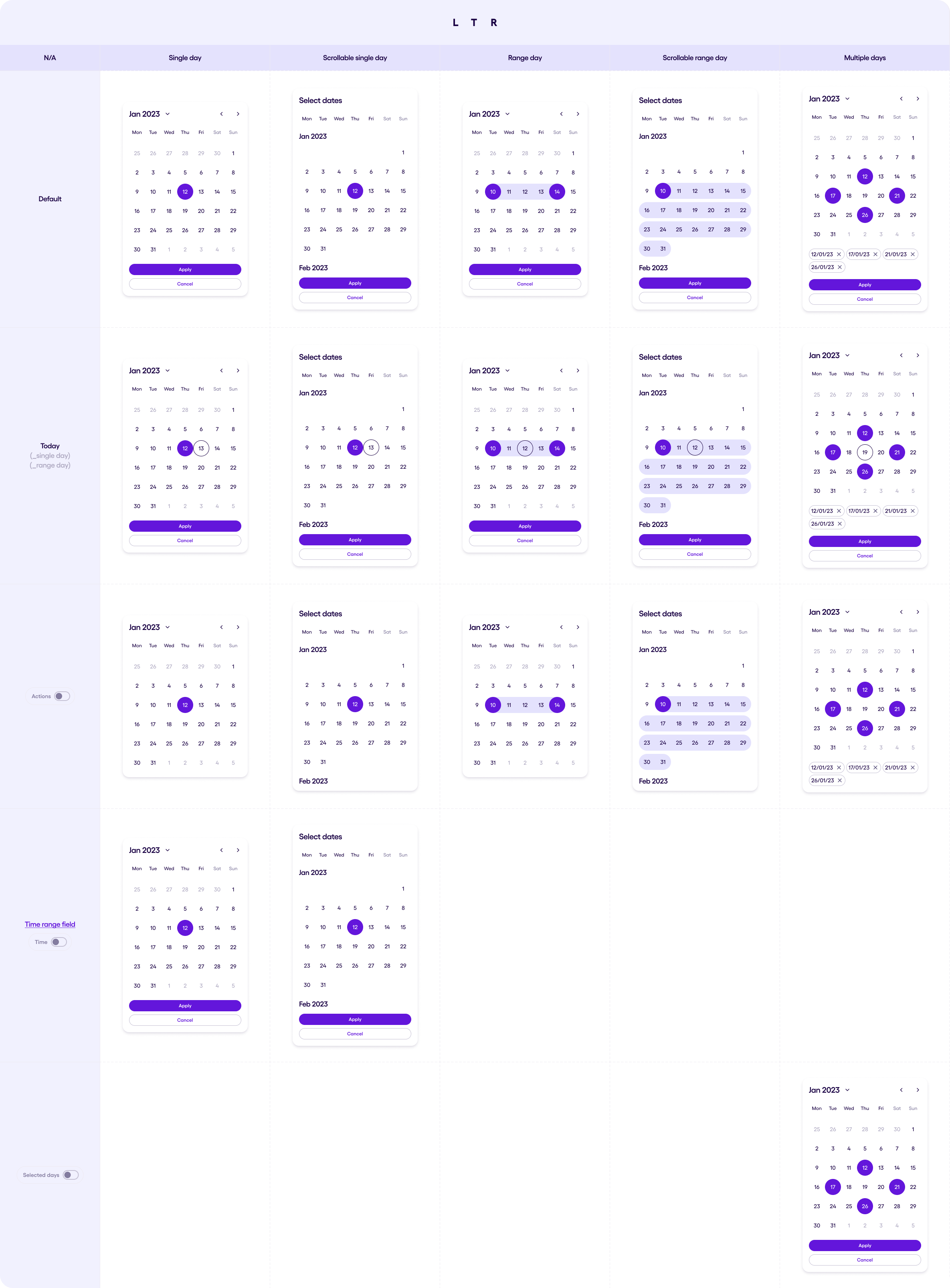
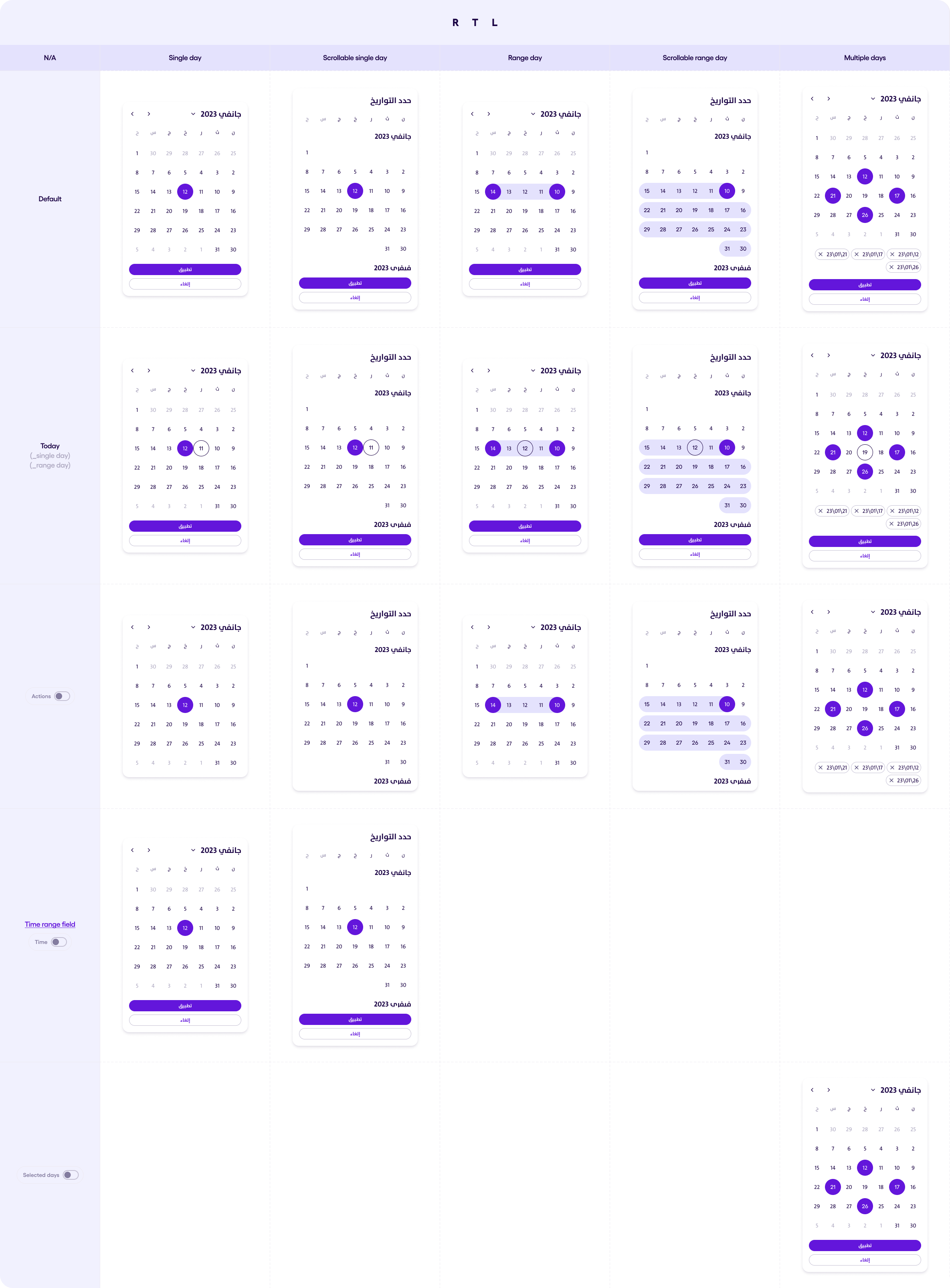
You can customise the date picker by choosing the following:
- startDayOfWeek : Which is the first day of the week in the Calendar View in the date picker
- startDayOfWeekend : Which is the first day of the weekend in the Calendar View in the date picker. Weekends have a different color key, you can avoid this effect by passing null here.
- calendarStart: pass a CalendarMonth object to indicate the first available CalendarMonth of the Calendar in the DatePicker.
- calendarEnd: pass a CalendarMonth object to indicate the last available CalendarMonth of the Calendar in the DatePicker.
- selectCalendarMonth: pass a CalendarMonth object to indicate which month do you want to be displayed when the Date Picker launches. If not passed or null, the cureent Calendar Month will be displayed.
- markToday : ALlows you to have Today´s date marked on the calendar view by being circled.
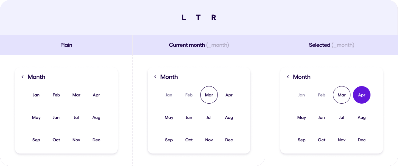
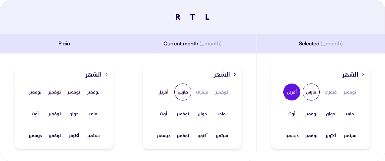
Month Picker v1.0.0 #
Month Picker is a dialog which gives a user a possibility to choose a month. Currently this component does not work alone, only with Date Picker component.
The number of rows and columns in the picker is depends on the size of the native Android dialog, that’s why in one phone the grid can be 3x4 but in another 4x3.
The monthes on the Month Picker has different states
- Current month
- Disabled
- Enabled
- Focused
- Selected
All of these states can be found in the picture below
After the user chooses the month, Month Picker will authomatically close and pass the chosen month to the callback.
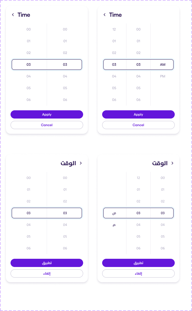
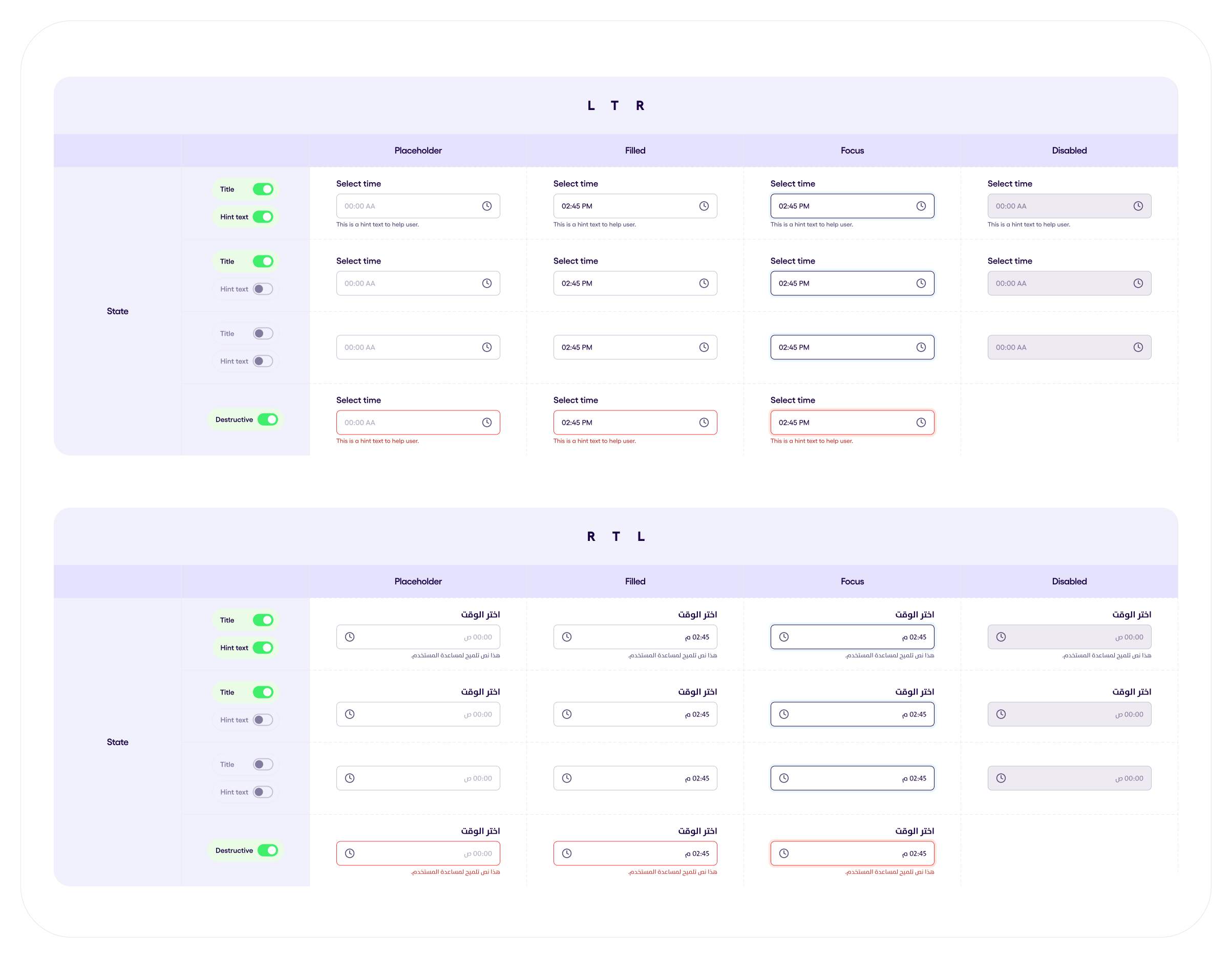
Time Picker v1.0.1 #
The TimePicker component provides a user-friendly interface for selecting a time within a specified range. It supports different time formats, minute increments, and allows customization of the visual and functional aspects. The component also includes options to specify a starting time, minimum and maximum selectable times, and custom text for action buttons. Below you can see the TimePicker component in both LTR and RTL directions.
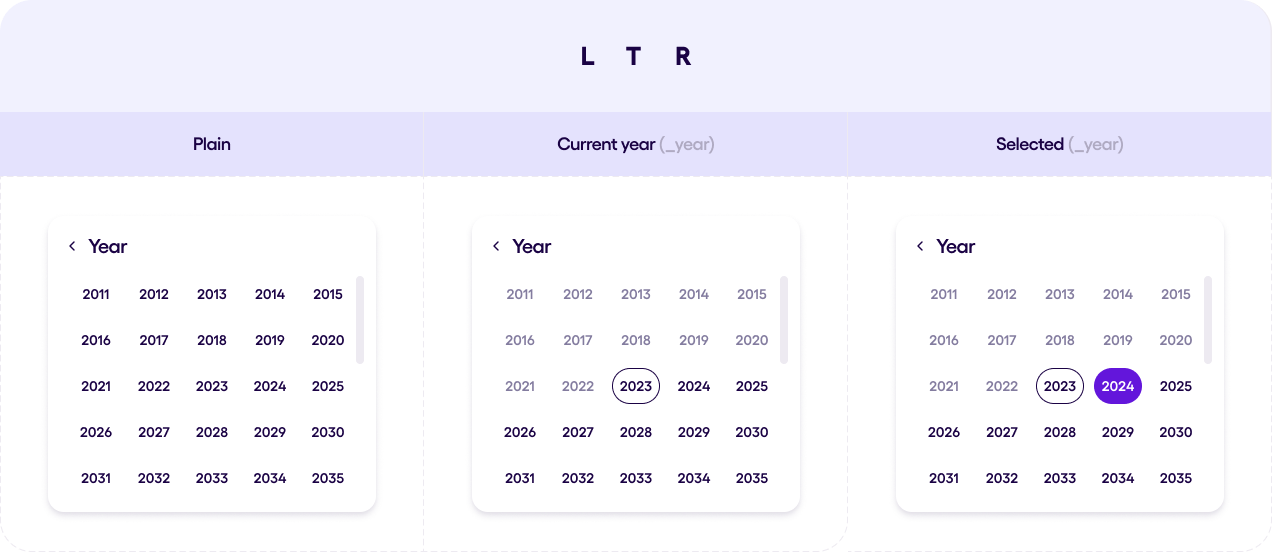
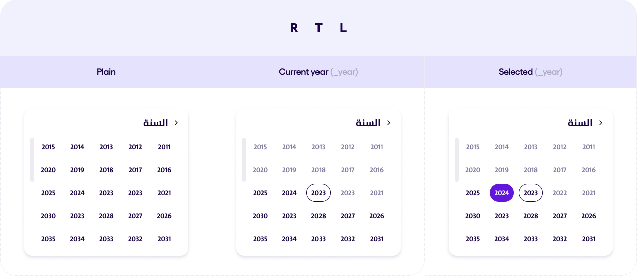
Year Picker v1.0.0 #
Year Picker is a dialog which gives a user a possibility to choose a year. Currently this component does not work alone, only with Date Picker component.
The number of rows and columns in the picker is depends on the size of the native Android dialog.
The user can set a start year from which the count will start, or leave it empty. This way the year list will start from the current year.
The monthes on the Year Picker has different states
- Current year
- Disabled
- Enabled
- Focused
- Selected
All of these states can be found in the picture below.
After the user chooses the year, Year Picker will authomatically close and pass the chosen year to the callback.
Divider v1.0.0 #

The available divider types are:
- Simple (with subtypes Default, LeftAligned, RightAligned, HorizontalAligned), with thickness = 1.dp
- Doubled, with thickness = 4.dp
- Thick, with thickness = 8.dp
- Dotted, with thickness = 4.dp
The orientation of the divider:
- Horizontal
- Vertical
The Simple type dividers support the following alignments when in horizontal orientation:
- Default: Fills the entire width of the container.
- LeftAligned: Has left padding of `spacing3`.
- RightAligned: Has right padding of `spacing3`.
- HorizontalAligned: Has horizontal padding of `spacing3`.
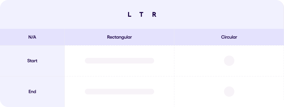
Flags v1.2.0 #
The image below demonstrates how the flags of all supported countries in Sefar look in 3 different sizes
- Small,
- Medium,
- Large
and in 2 shapes
- Circular
- Rectangular
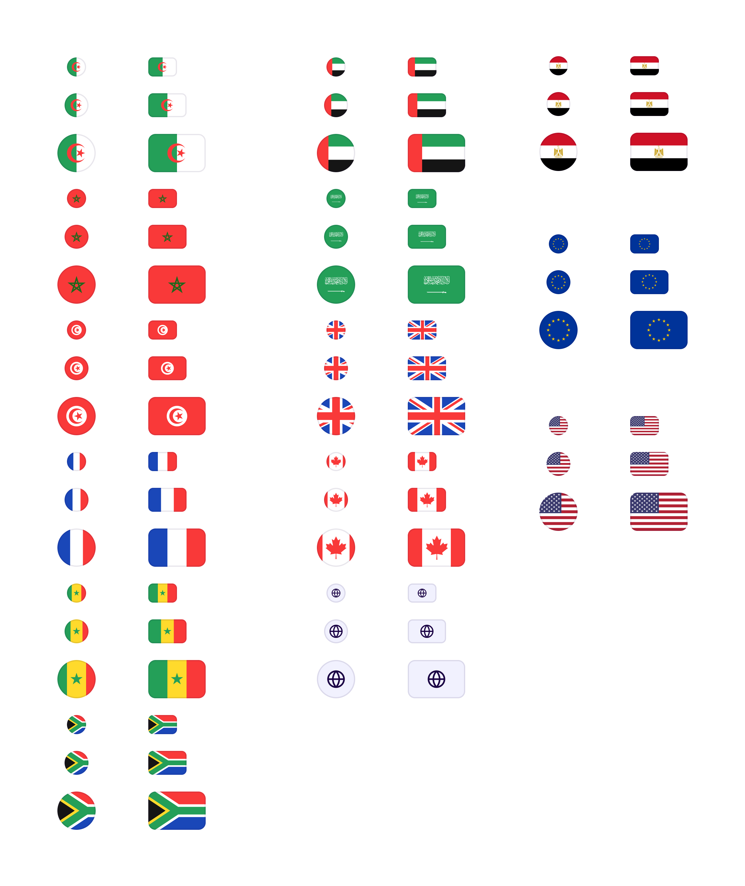
Image PlaceHolder v1.0.0 #
The Image Placeholder component is used in card components to show where an image will go. It supports different aspect ratios and orientations to keep designs consistent.
Aspect Ratio Options:
- 1:1 (Square)
- 5:4 | 4:5
- 4:3 | 3:4
- 7:5 | 5:7
- 3:2 | 2:3
- 16:10 | 10:16
- Golden Ratio 1.618f
- 5:3 | 3:5
- 16:9 | 9:16
and in 2 Orientation
- Landscape: Wider than tall.
- Portrait: Taller than wide.
Input Fields #
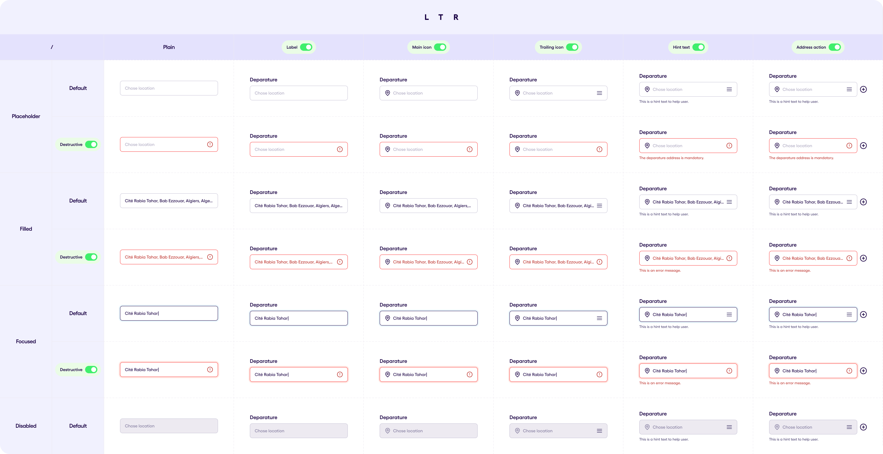
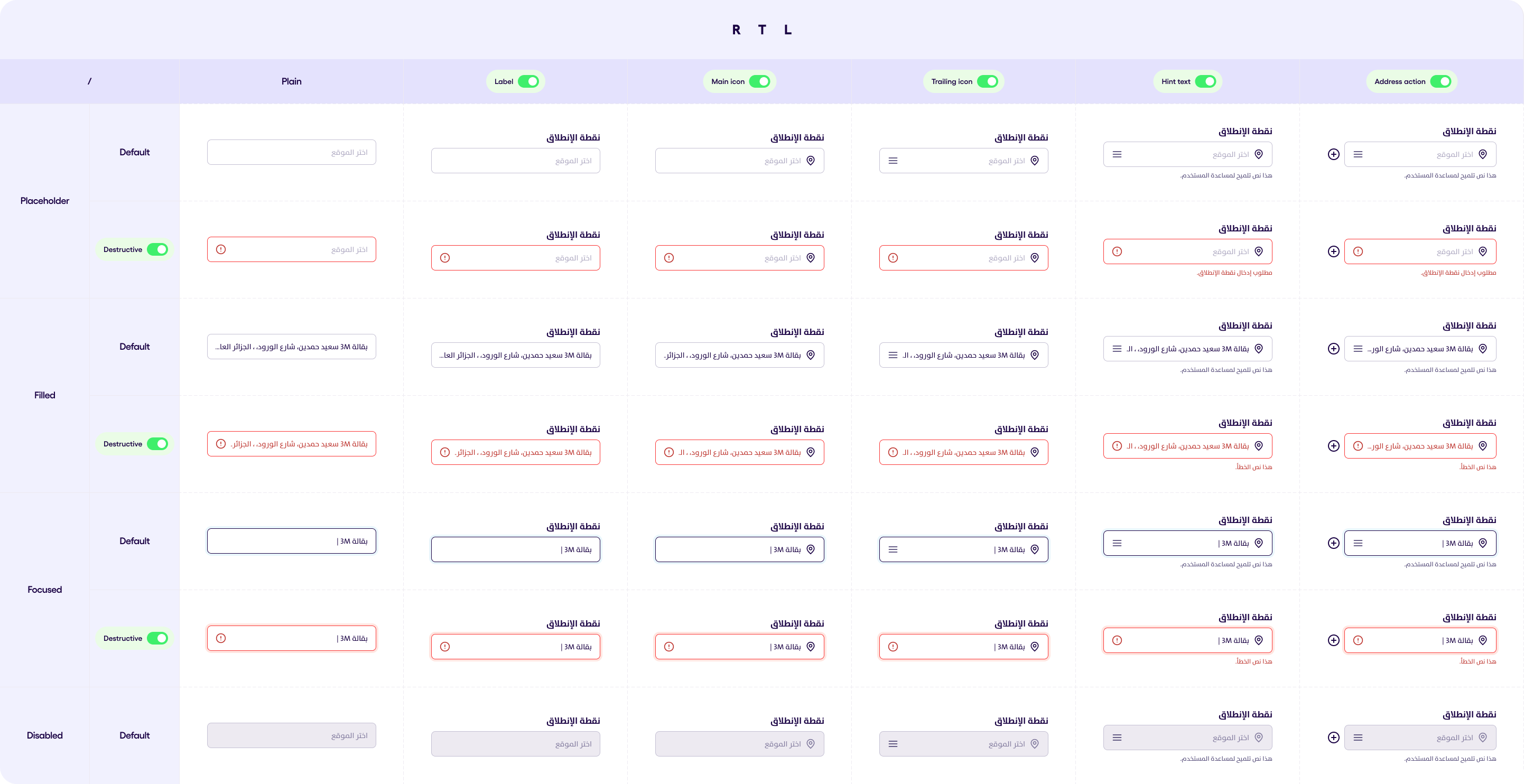
Address Field v1.0.2 #
The Address Field has 3 types:
- Departure,
- Stop
- Destination
All the three types above have:
- Leading icon (Optional) that has 4 options: _DoubleLocationPins_, _Flag_, _MarkerPin_, or _StartingPoint_
- Label (Optional)
Destination & Stop fields has two extra options :
- Trailing icon “Drag icon“ (Fixed icon & Optional)
- Address Action (Which is fixed to “Plus Circle“ for Destination field & “Minus Circle” for the Stop field and is Optional)
Below you can see the images representing different states of the Address Field in LTR and RTL:
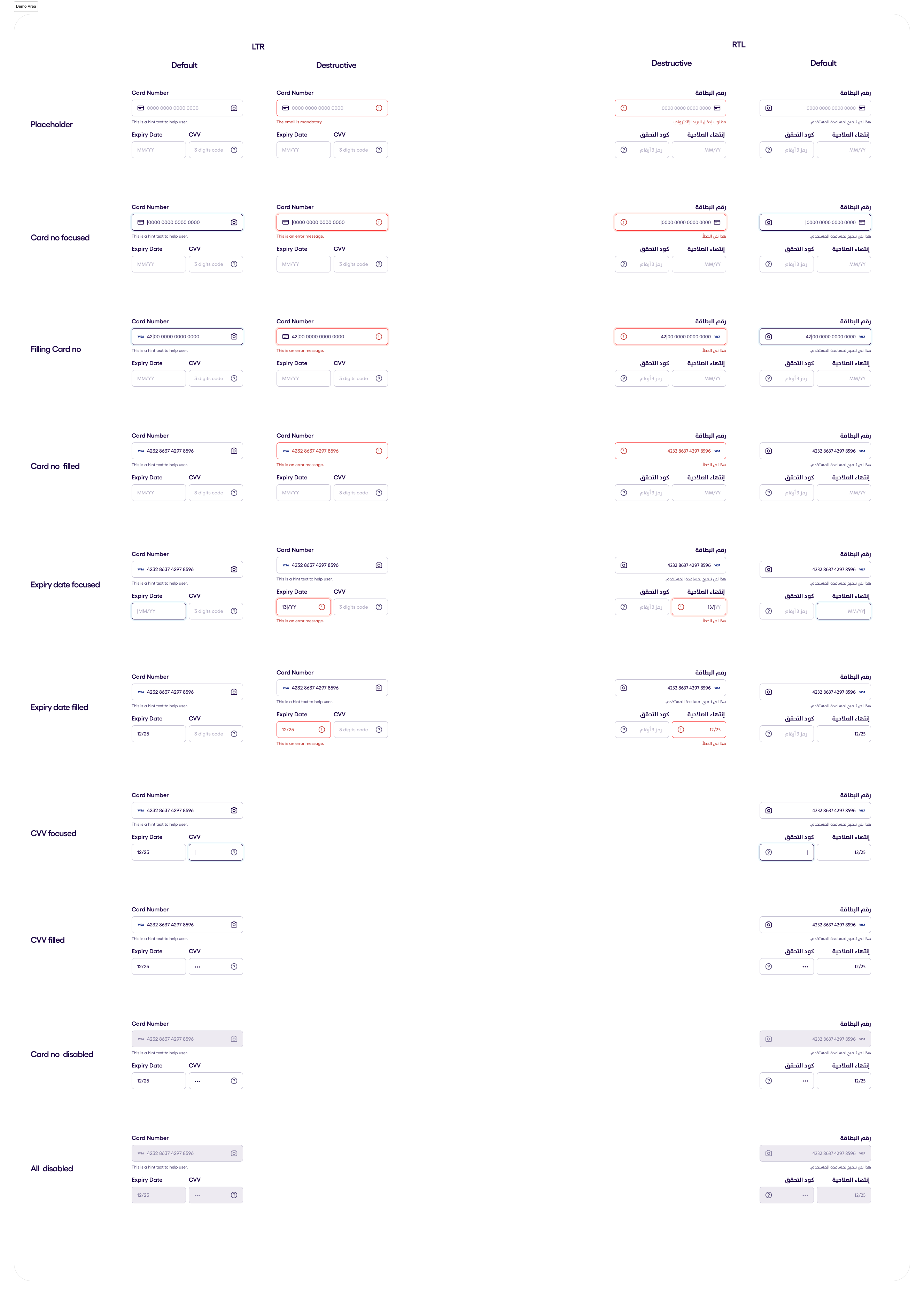
Credit Card Input v.1.0.2 #
A composable that displays input fields for credit card details, including card number, expiry date, and CVV. The credit card input can detect and show the icon logo(leading component) for 4 types of credit cards:
- Visa
- MasterCard
- Americain Express
- Discover
Other credit cards are also supported but the standard credit card leading icon will be shown for them. The cvv foreach is 3 digits long, except for Americain express it will be 4 digits long.
In the image you can see the fields alongside the diffirent states that they can have.
Currency v.2.0.0 #
The following illustration shows all the states of the currency input field. It comes with a drop down menu to select the currency. Each state is shown on a separate row, and they are as follows in order:
- Default
- Filled
- Focused
- Disabled
- Default (desctructive)
- Filled (desctructive)
- Focused (desctructive)
The currency field, like all Sefar components, supports RTL as shown on the 2 rightmost columns.
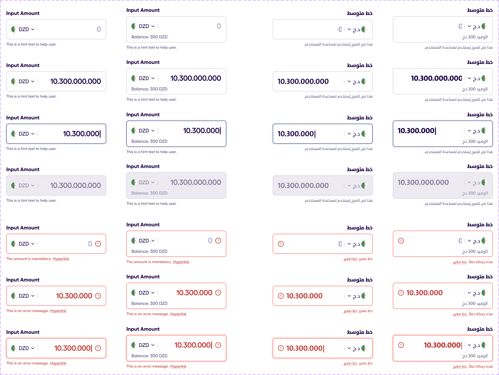
Currency field input is used for setting the money value in a specific currency. The field is consists of:
- Currency text, which changes depending on the currency and the flag
- Input, where the amount of money must be typed
- Balance, which is an edditional field, that can be hidden
- A hint, with the option to add a hyperlink or hide it at all
The destructive behaviour is also included and is presented by red borders, hints and exlamation mark image.
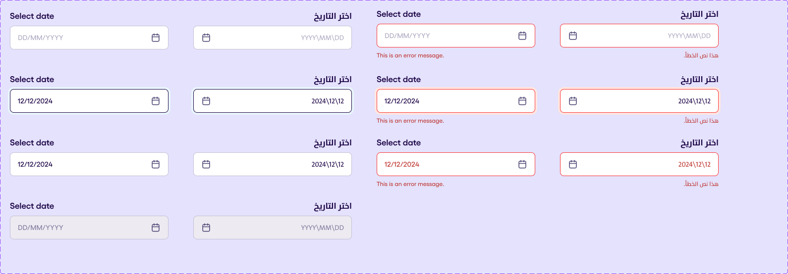
Date Field v1.0.1 #
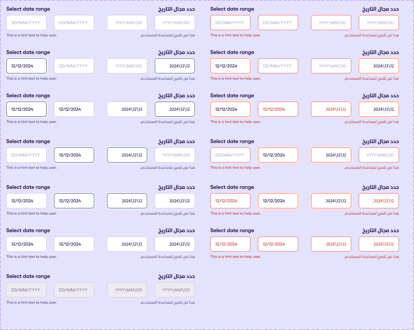
Date Range Field v1.0.1 #
Select a range of dates, min & max eg. April 1st - April 16th.
It support the following formats :
-
DD/MM/YYYY
-
MM/YY (for the credit card field)
It have multiple states:
-
Placeholder
-
Focused (For Date Range & Time Range, we’ve first focused & second focused )
-
Filled (For Date Range & Time Range, we’ve first filled & second filled )
-
Disabled
-
Destructive
-
Non-Destructive
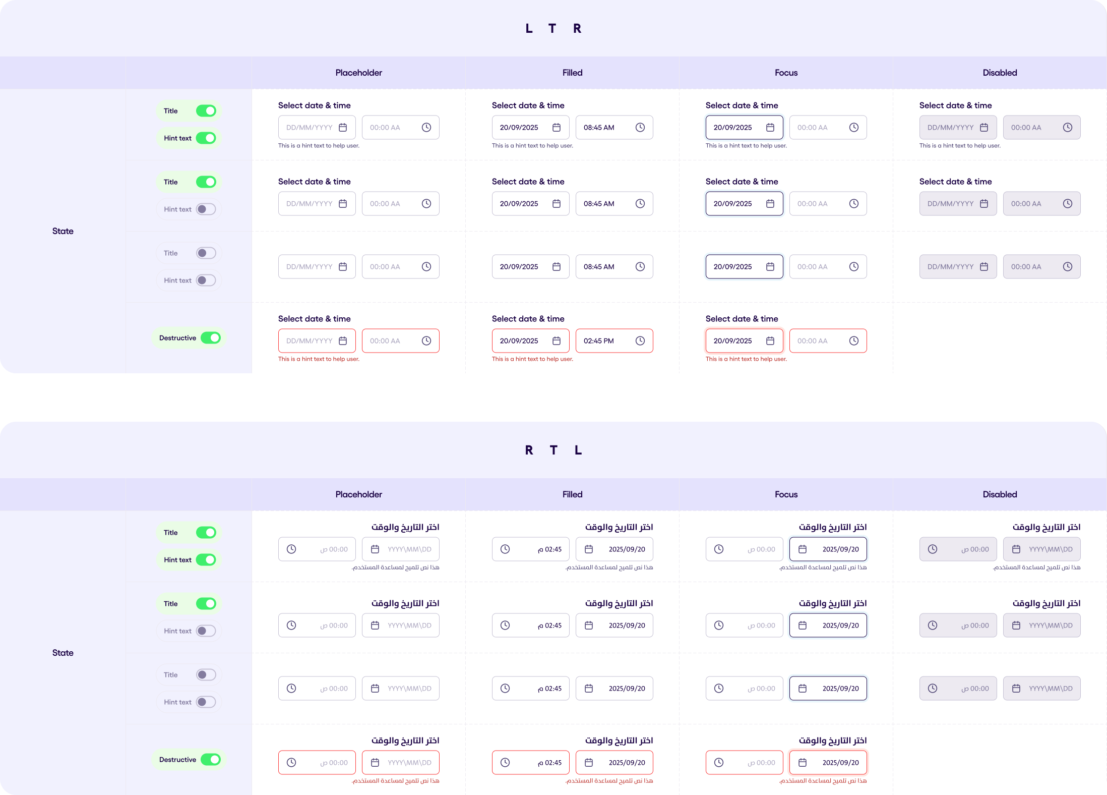
DateTime Field v1.0.1 #
An input field composable that let the user pick a date and a time.
Dropdown Field Input v2.0.3 #
Select a single date eg. April 16th, 2024 It support the following formats :
- DD/MM/YYYY
- MM/YY (for the credit card field)
It have multiple states:
- Focused (For Date Range & Time Range, we’ve first focused & second focused )
- Filled (For Date Range & Time Range, we’ve first filled & second filled )
- Disabled
- Destructive
- Non-Destructive
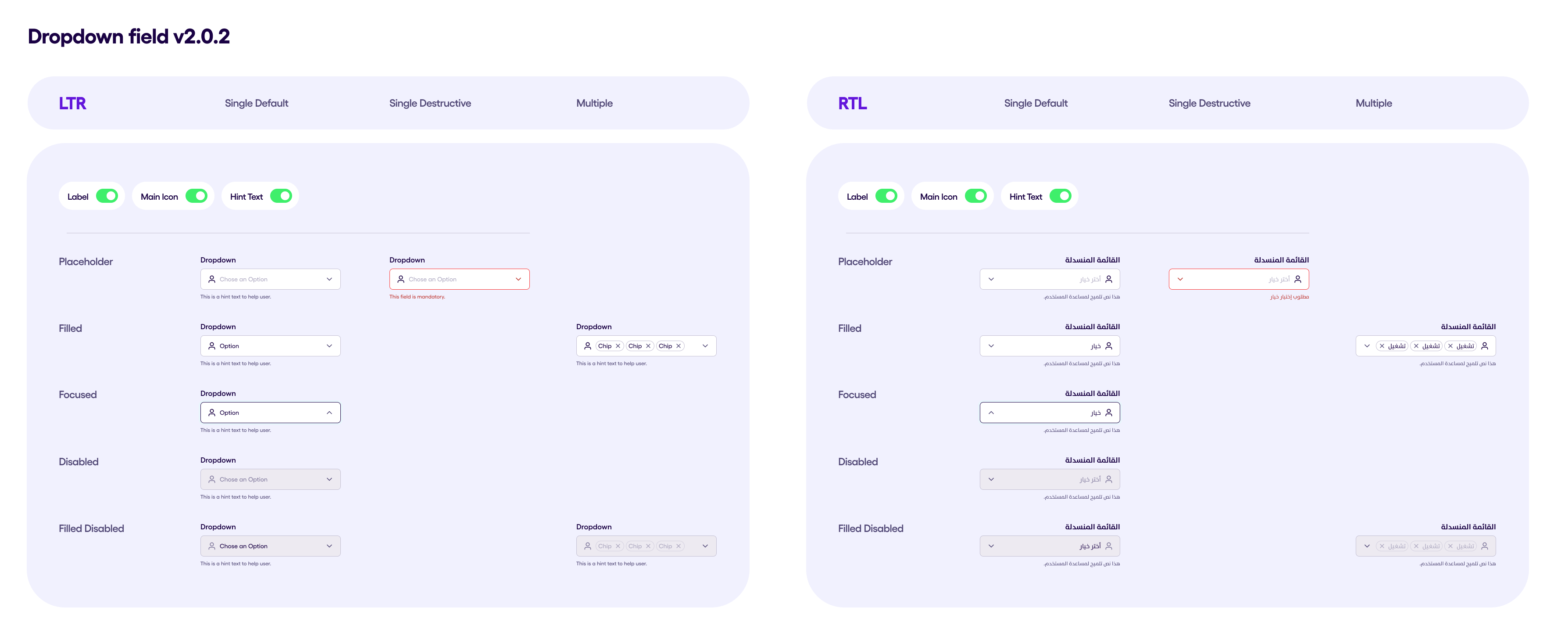
The Dropdown Field v2.0.3 showcases a versatile input field used for selection from a list of options. The component supports multiple states and behaviors to cater to different user interactions and visual requirements. States:
- Placeholder: This state is visible when the dropdown is inactive, displaying a placeholder text. If hint text is enabled, it appears below the dropdown field.
- Focused: The dropdown gains focus, indicated by a highlighted border, and the dropdown menu expands to show available options.
- Filled: Once an option is selected, the selected item(s) appear inside the field. If multi-select is enabled, multiple items are shown with a clear button for each.
- Disabled: The entire field is inactive, appearing greyed out and unresponsive to user interactions.
- Error: In the destructive state, the dropdown displays red borders and hint text, indicating an error or mandatory input.
Behavior:
- RTL Support: The component adapts to both LTR and RTL languages, with the dropdown icon and text alignment adjusted accordingly.
- Multi-Select: When enabled, users can select multiple items from the dropdown, each displayed as a chip with a clear option.
- Search Functionality: A built-in search input allows users to quickly filter through available options.
- Customizability: Labels, icons, hint text, error messages, and button texts are customizable, offering flexibility to fit different use cases.
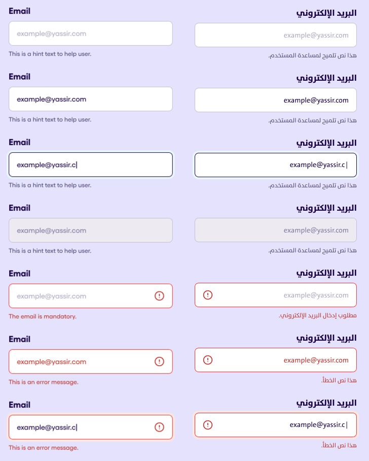
Generic Input v1.0.1 #
The following illustration shows all the states of the generic input field. It dynamically expands to a maximum of 5 lines. Each state is shown on a separate row, and they are as follows in order:
- Default
- Filled
- Focused
- Disabled
- Default (desctructive)
- Filled (desctructive)
- Focused (desctructive)
The phone RTL is shown on the last column. The following properties are optional: Label, Trailing Icon, Hint.
OTP Code v1.1.2 #
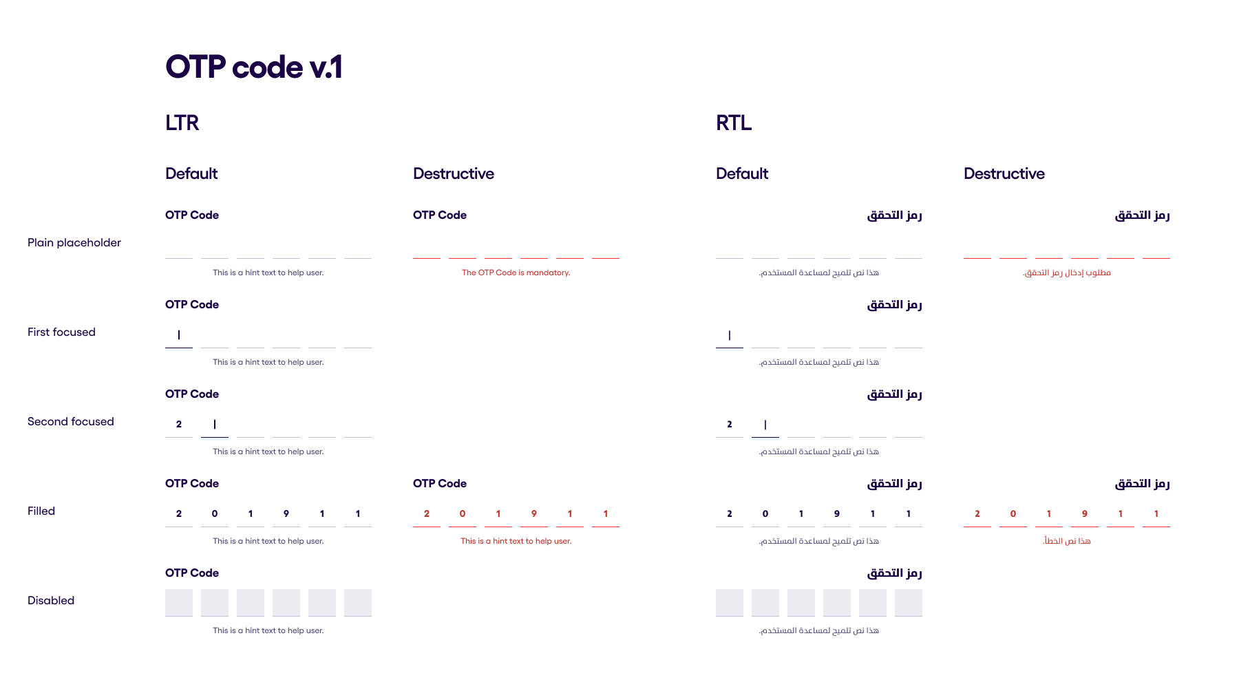 OTP code is authomatcally generated numeric code, which is used to confirm a transaction or a process.
It consists of six separate input views, each of which expect a number. The focus of the field must authomatically transfer to the next input field after the number is present.
The numbers, which was already typed is visible after the focus has moved to the next input.
In the following image is showing all the states of the OTP Code input. It has the following states:
- Plain placeholder - state when the input is shown but the focus is clear and the keyboard is hidden
- First focused - state when the otp code field's first box changed color to the focused one
- Second focused - state when the otp code field's second box changed color to the focused one
- Filled - state when all the otp code box is filled with data
- Disabled - state when the whole input is unclickable and unfocused
The image also showing the behaviour of the input both in RTL and LTR.
Also two behaviuors are presented in the following image:
- Default
- Destrutive
Destructive behaviour shows red borders of the input boxes, red hint (if hint is visible) and red numbers which was typed down.
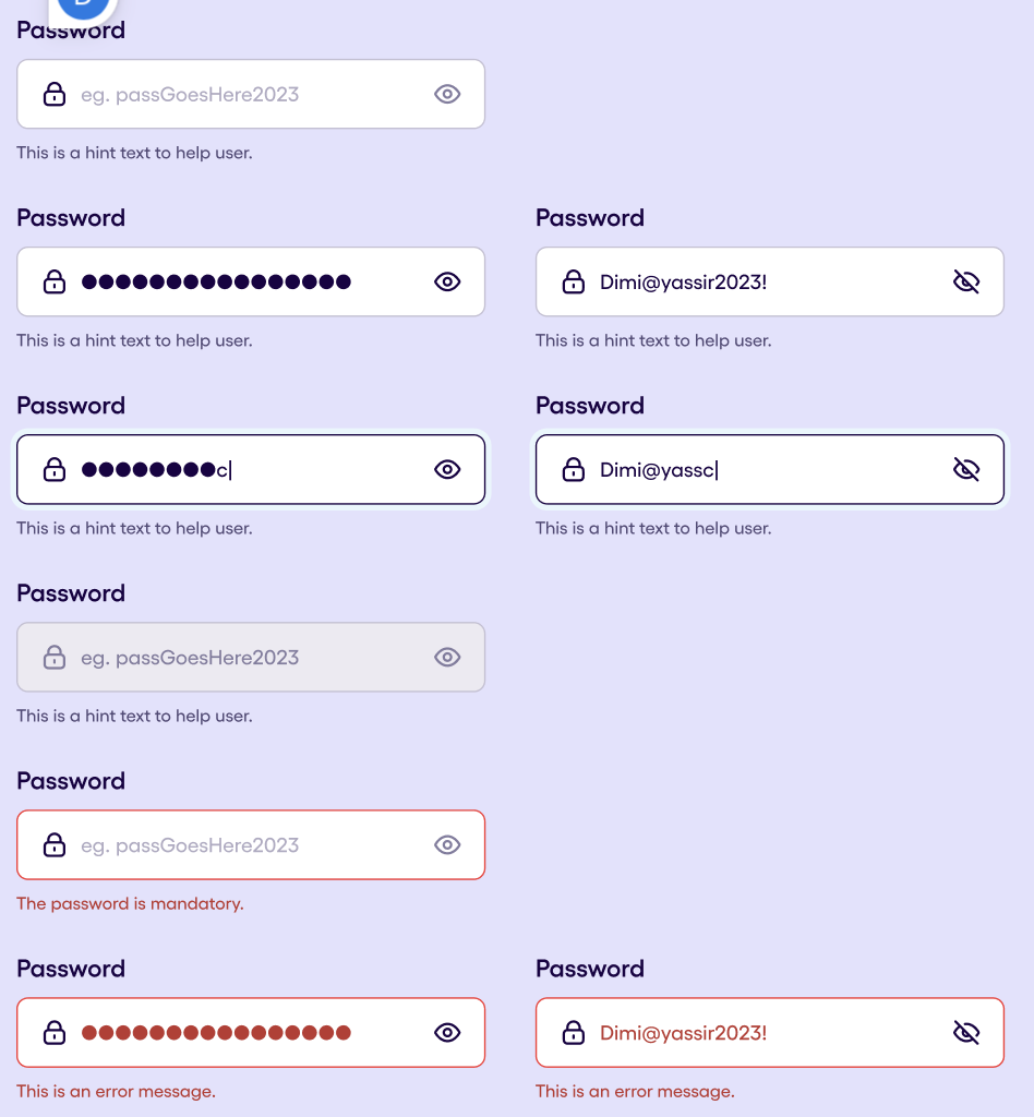
Password Input v1.0.1 #
The Password Field´s structure, the input field consists of the following elements:
- Label
- Heading icon
- Content (Mandatory)
- Trailing icon → Eye with Hide/Reveal state
- Hint text
Behaviour:
- Characters are by default in Hide mode, replaced by dots.
- Upon tapping on the trailing (eye) icon, content reveal toggles
Password Field has 4 states:
- Placeholder
- Filled
- Focused
- Disabled They can also be:
- Non-destructive
- Destructive
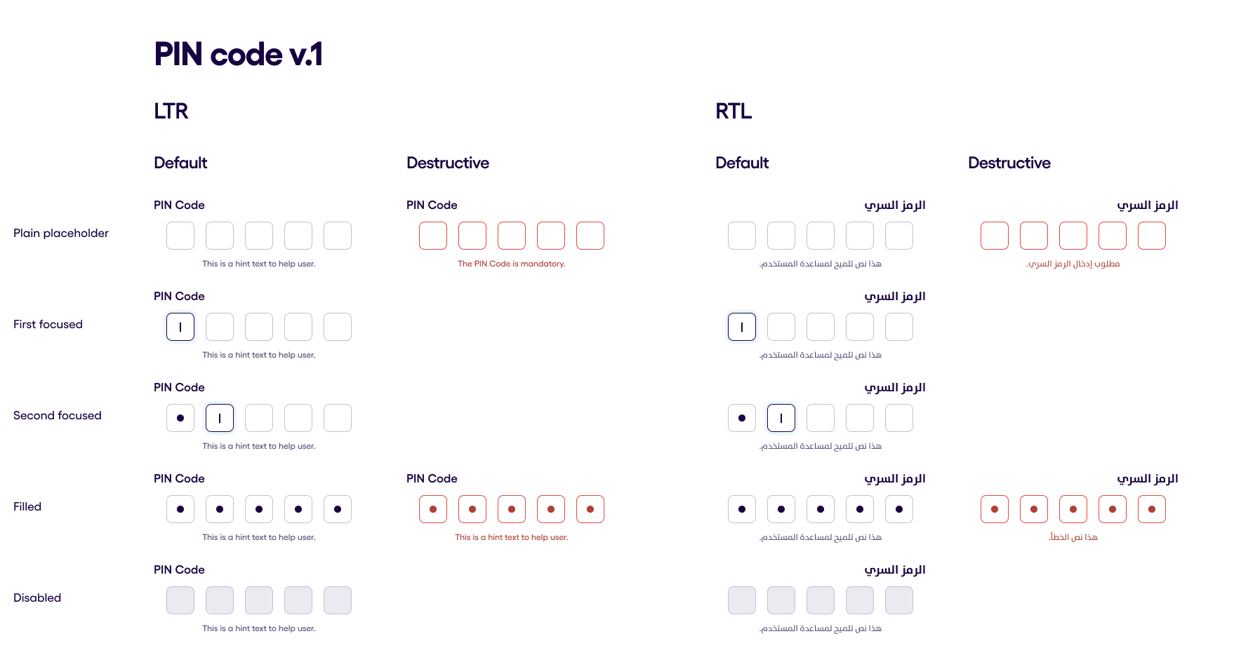
PIN Code v1.0.2 #
In the following image is showing all the states of the Pin Code input. It has the following states:
- Plain placeholder - state when the input is shown but the focus is clear and the keyboard is hidden
- First focused - state when the pin code field's first box changed color to the focused one
- Second focused - state when the pin code field's second box changed color to the focused one
- Filled - state when all the pin code box is filled with data
- Disabled - state when the whole input is unclickable and unfocused
The image also showing the behaviour of the input both in RTL and LTR.
- The RTL variant will be filled from Left to Right.
Also two behaviours are presented in the following image:
- Default
- Destrutive
Destructive behaviour shows red borders of the input boxes, red hint and red dots which states for input data.
Pin code input field also has a few special features:
- Characters are always masked.
- An unsuccessful PIN entry also gives a nudge (vibration) to the user and doesn’t close the keyboard.
- After an unsuccessful PIN entry, the field is moving from the “Error filled” to the “First focused” state within 1 second.
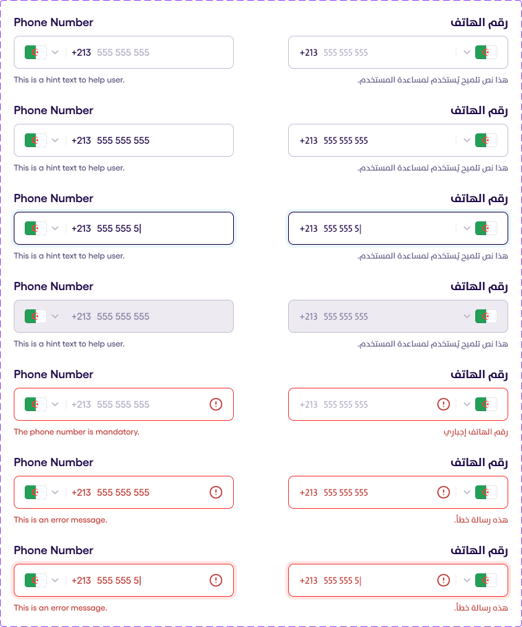
Phone Number v2.1.3 #
The following illustration shows all the states of the phone input field. It comes with a drop down menu to select the country from the countries.
Each state is shown on a separate row, and they are as follows in order:
- Placeholder
- Filled
- Focused
- Disabled
- Placeholder (desctructive)
- Filled (desctructive)
- Focused (desctructive)
The phone RTL is shown on the right column.
Country Backdrop 1.0.3 #
Phone Input also has a backdrop to choose the country. In order to choose it the user must click on the country flag on the input and the backdrop with the list of countries will be displayed.
There are 3 types of countries list which is available:
- Yassir Core Countries
The 6 countries which is considered to Yassir core are (Algeria, Tunisia, Morocco, Senegal, France, South Africa)
- Supported Countries
The 12 countries which is considered to Supported are (Algeria, Egypt, France, USA, Canada, Senegal, South Africa, Great Britain, South Africa, Saudi Arabia, UEA, Morocco)
- Mixed countries
It is the list which is created by the consumer by his own. Mixed countries list can have countries both from Supported countries list and also a custom added ones.
Backdrop also has a Search Input field to find the need country by the name.
Search Input 1.0.4 #
Search Input is a specific input field which is used to type a search request. It characterized by a search icon in the beginning of the input field and has a cross icon to delete all the typed data.
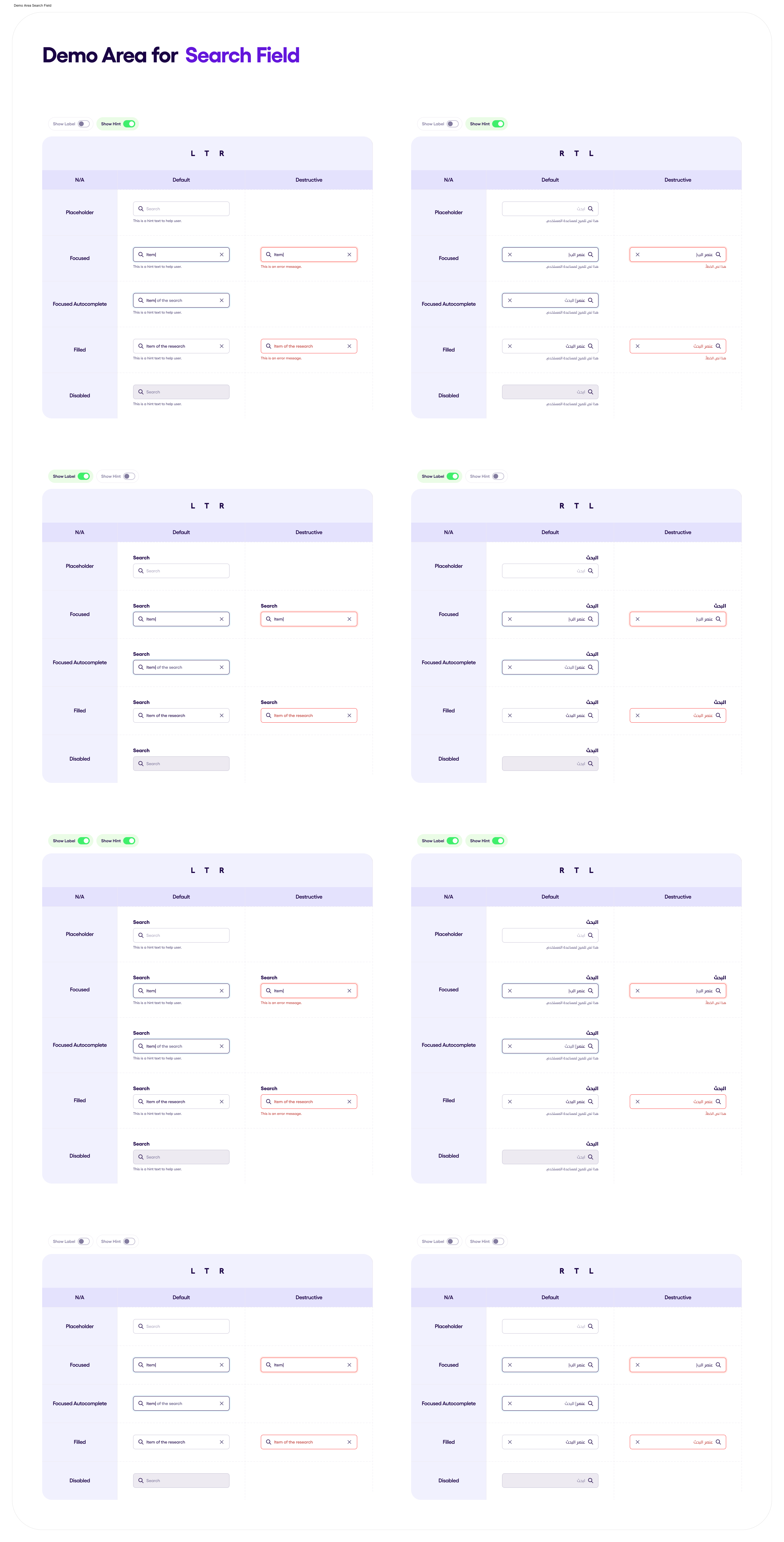
4 states are available in the Search Input
- PlaceHolder
- Focused
- Filled
- Disabled
REMARK: Autocomplete and descturctive behaviour are currently unavailable in the Search field.
The illustrated input field is available in both RTL and LTL.
When the users clicks of the input field it becomes focused and the keyboard appears. After that the typing is available. If the user clicks outside the search input view the focus be remain of the search input but the keyboard hide itself.
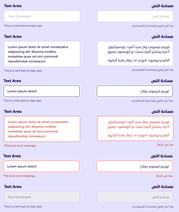
Text Area v1.0.3 #
The following illustration shows all the states of the text input field. It dynamically expands to a maximum of 5 lines. Each state is shown on a separate row, and they are as follows in order:
- Default
- Filled
- Focused
- Filled (desctructive)
- Focused (desctructive)
- Disabled
The phone RTL is shown on the last column.
Time Input v1.0.1 #
TimeSelectionInput displays a customizable time selection field. This component allows users to pick a time using a time picker dialog.
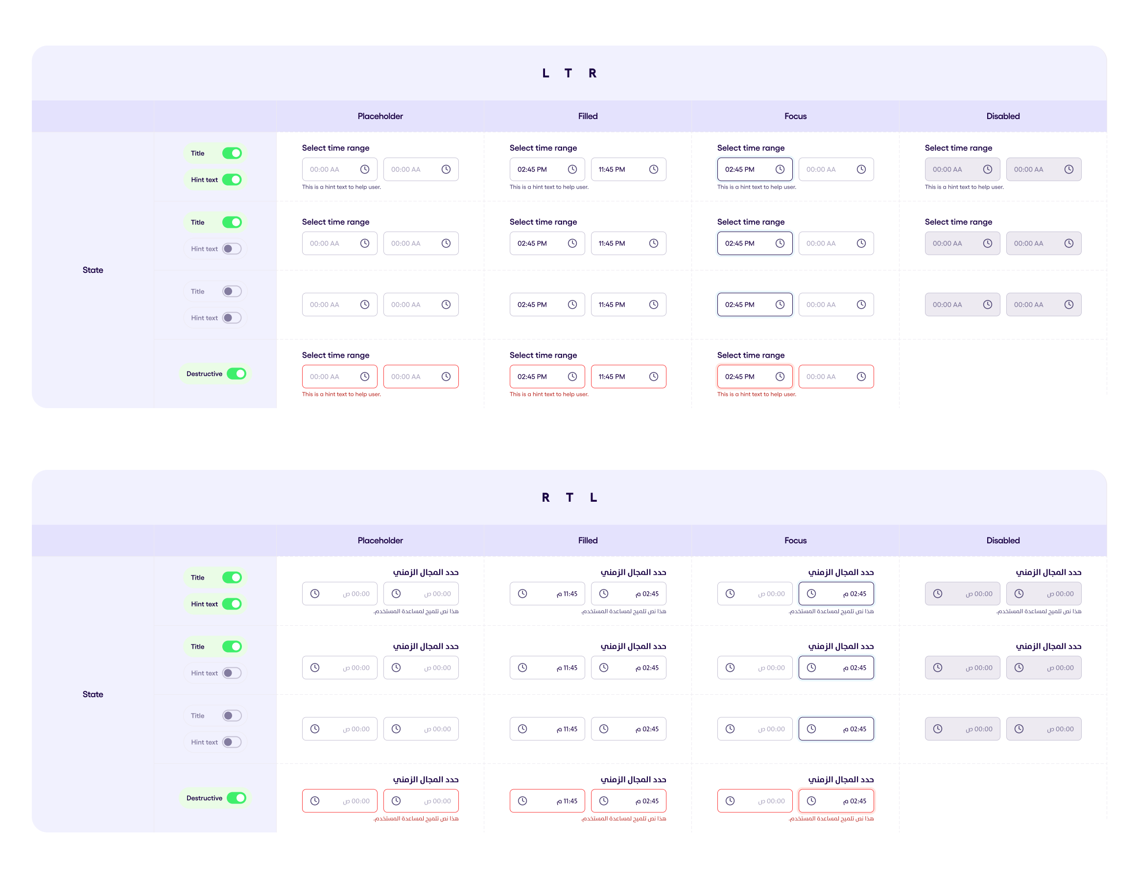
Time Range Input v1.0.1 #
Displays a customizable time range selection field. This component allows users to pick start and end times using a time picker dialog.
Lists & List Items #
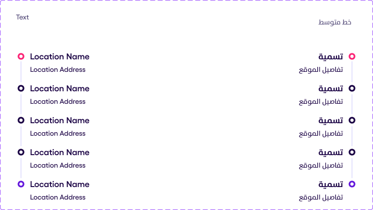
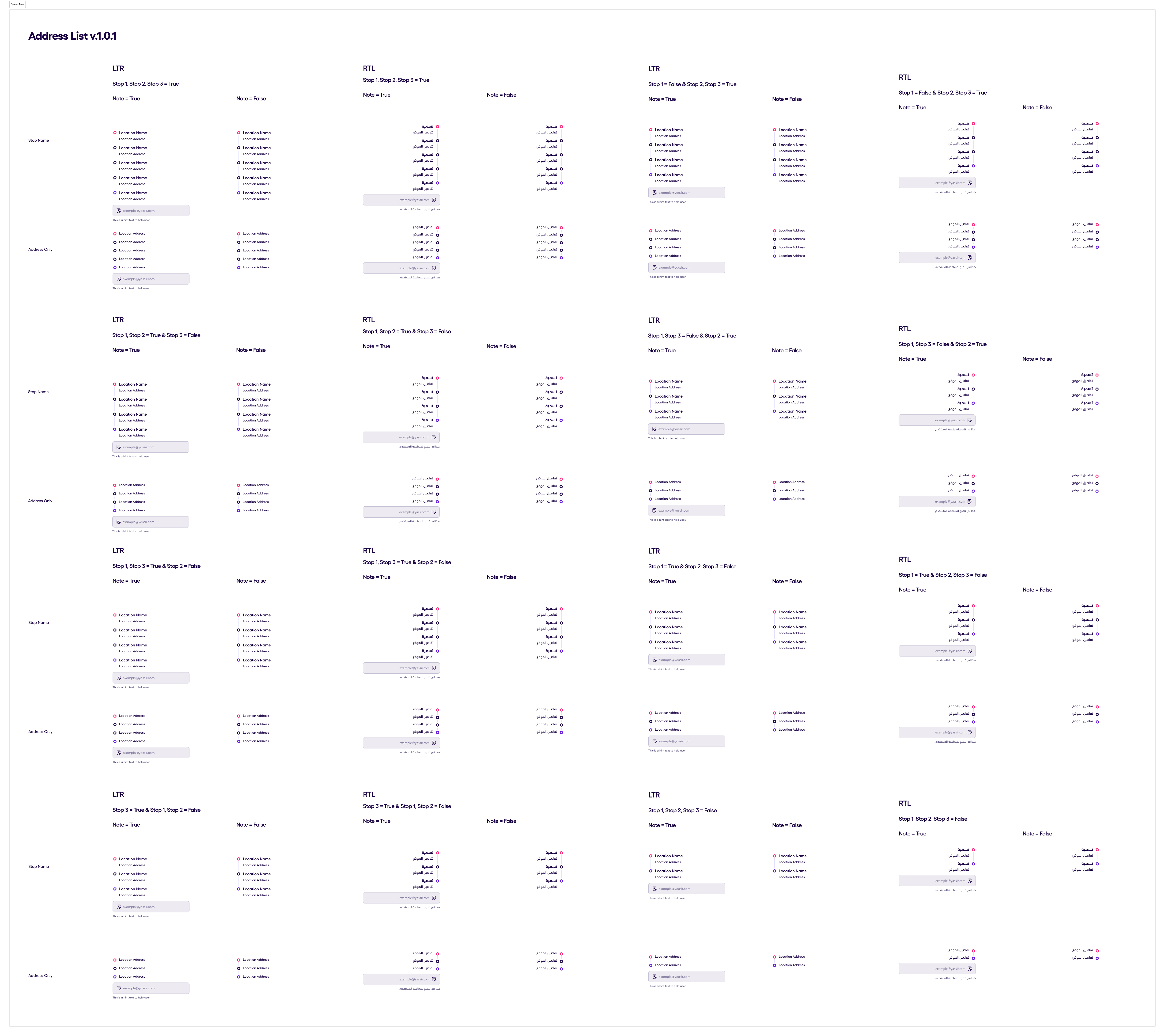
Address List v.1.0.4 #
An address List is a composition of Address locations and an optional text field. An address list should accept a list of locations.
A location can have:
- An optionl name as a string
- A mandatory address as a string
- An optional trip time string which will be displayed as a Tag component
A location can also be in a disabled state.
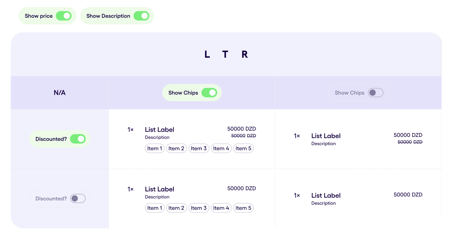
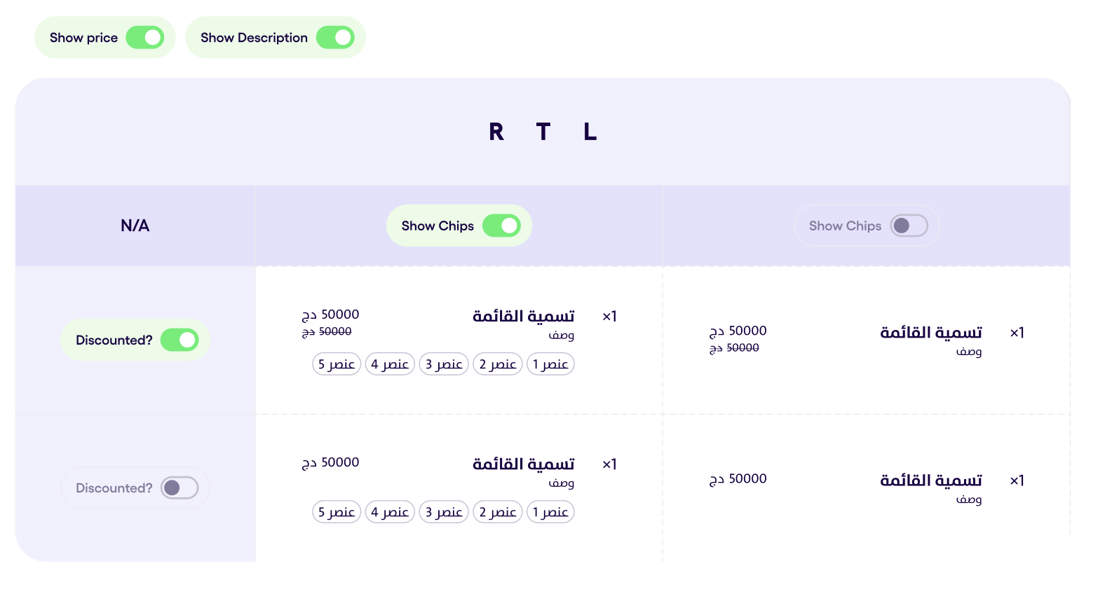
Checkout List Item v1.0.3 #
Checkout list item is presented only for showing the info, which is needed to the user. This element is not clickable.
It contains of next elements:
- Label
- Description (optional)
- Number of elements
- Price (optional)
- Discounted price (optional)
- Horizontal not clickable chips
In LTR the element is present in the next image:
In RTL the element is present in the next image:
List Item v1.3.0 #
List item is a components from which the lists will be generated. It has a lot of changeble elements, which can be adjusted to the purpose of the list. In the following image is presented the common list item in 4 different states:
- Default
- Focused
- Active
- Disabled

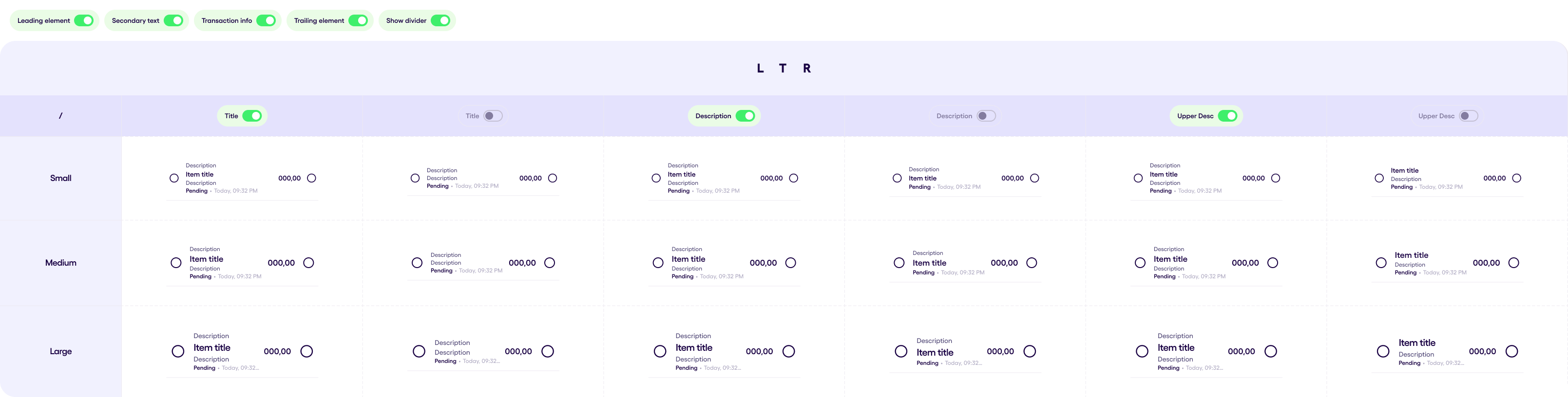
The main parts of the list item are:
- Upper Description
- Title
- Description
- Transaction Status
- Date
- Balance
- Leading element
- Trailing element.
All the elements can be shown and hidden expect of the title. It must always be present. Both RTL and LTL are supported.
List item can be is 3 different sizes:
- Small
- Medium
And all the data in the list item is being converted to the size which is set as the List Item Size.
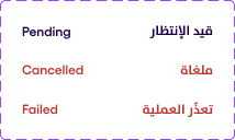
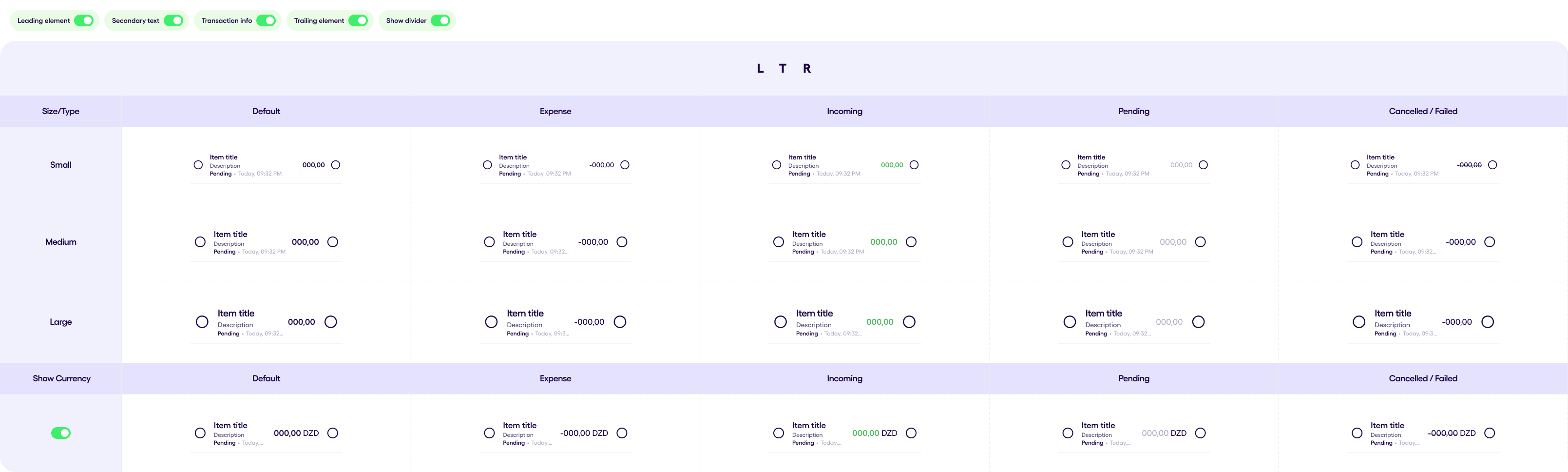
The Transaction Status of the list item can be presented in 3 states:
- Pending
- Failed
- Cancelled
And differs by the different colors which is presented in the image below
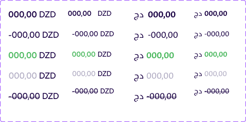
The balance is also presented by a few states:
- Default
- Exprense
- Incoming
- Pending
- Cancelled
All of the states differs by the color of the font style presented in the image below:
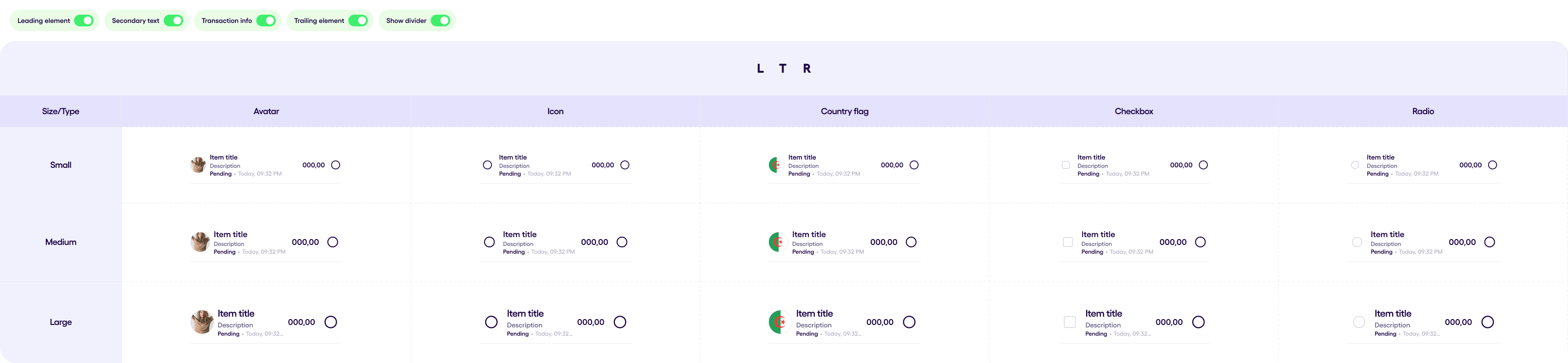
The leading element of the list item can be presented as a:
- Icon
- Avatar
- Flag
- Checkbox
- RadioButton
- Image
The visual part of the leading elements is presented in the following image for the better understanding

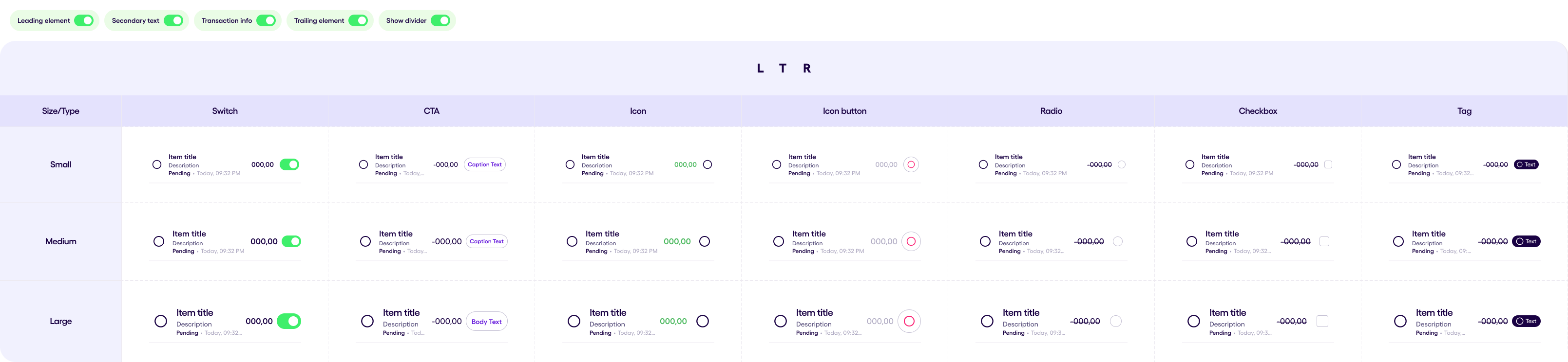
The trailing element of the list item can be presented as a:
- Icon
- Switch
- IconButton
- Button
- Checkbox
- RadioButton
- Tag
The visual part of the trailing elements is presented in the following image for the better understanding

Examples of usage different leading and trailing elements are presented below
Leading Element Demo Area
 List Text Demo Area
Balance Demo Area
Trailing Element Demo Area
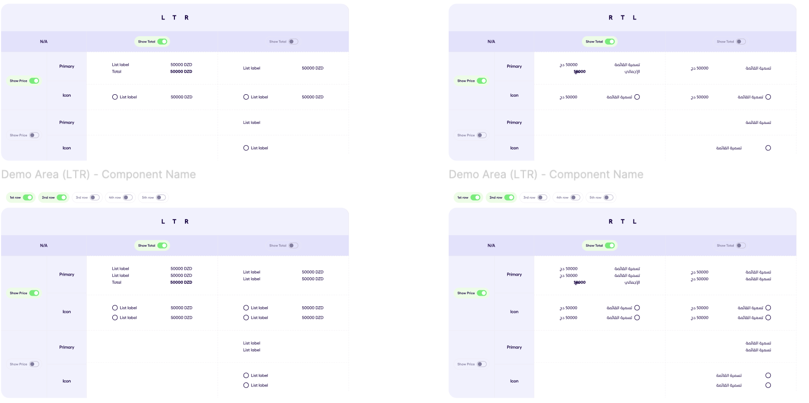
Price List v2.0.0 #
Price list item consists of:
- Icon
- Label
- Discount Tag
- Price Text
- Currency
Price List can be divided into 2 types:
- Primary
- Icon
Primary type is a Price List without an Icon, which can be presented with the ‘Total’ item in the end of the list
Icon type is a Price List without an Icon in the start.
PriceList can have a discount tag next to the item label. This tag can be used to show the discount percentage
PS: Please note that ‘Total’ item cannot be present is the price is missing, or if the Icon type is on.
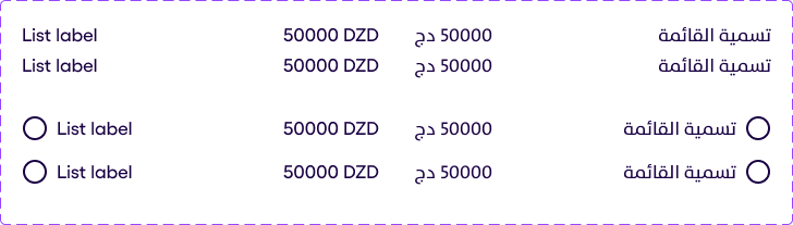
Selectors List v2.1.0 #
This component represents a list of selectors(radiobuttons or checkboxes), where each item of the list will have a selector and a label. A SelectorsList item can have the next optional elements:
- Icon
- Price Text
- Currency Text
Items in the SelectorsList can be in a disabled state and can have an outline, in addition, the last item of a SelectorsList can have an optional TextArea.
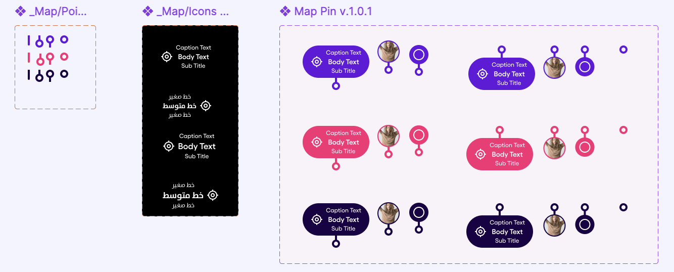
Map Pin v1.1.0 #
The Map Pin Types can be presented in 4 types:
- Pin with an Icon and Texts
- Icon Only
- Avatar
- Dot Only
For the First type, we have 3 layers of text, two of them are optional:
 - Main Map pin text (Body Small Semibold)
 - Caption text (above the main text: Caption Regular / Optional)
 - Subtitle (below the main text: Caption regular / Optional)
Each Map pin except the Dot only Type has a direction:
 - Up
 - Down
For colors we’ve 3 of them:
- Primary
- Secondary
- Neutral
- Informative
Modal v1.0.1 #
Modal is a view which can be presented above the main view on the screen. It looks like a backdrop, but in modal it is impossible to close it without clicking on the one of the buttons which is presented on it.
Modal can be presented in to types:
- Empty state Modal
- Slot Modal
Empty state Modal has an Empty State and 3 buttons, each and every one of which can be hidden.
Slot Modal is a Composable which the comsumer can put by himself with 3 buttons, which have the same logic as in the Empty State type.
OptionsMenu v1.0.0 #
OptionsMenu is a list of 2 to 9 actions that can be performed by the user, each of the actions can have an icon and a label, and can be in a destructive or disabled state.
Price v1.0.1 #
Price Component is consist of two separate TextField every one of which indicates the particular price. The first price is the regular price and it is a mandatory field and the discount price which is a optional field.
Discount price has a strike through to indicate the previous price
Price Component can be presented into two layout directions:
- Horizontal
- Vertical
The size of the component is:
- Small
- Large
The component is presented into both LTR an RTL.
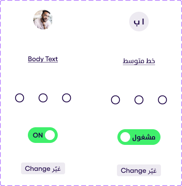
Profile Photo v1.2.4 #
Below, you can see the Profile Photo component displayed in three different sizes: Small, Medium, and Large. Each size includes various status icons and states. The image also demonstrates the component in both left-to-right (LTR) and right-to-left (RTL) directions.
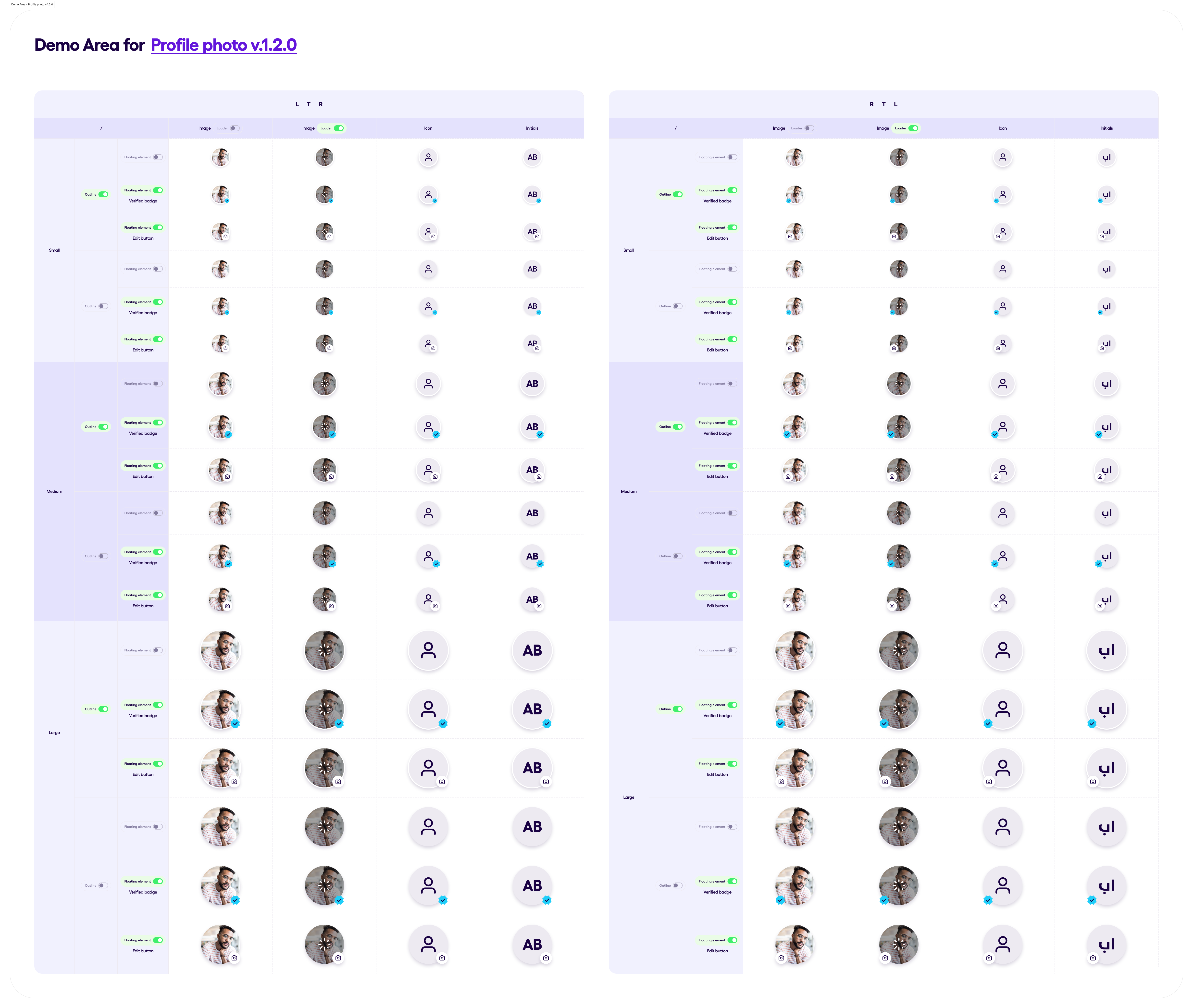
For each size the following examples are shown: Outlined Profile Photo:
- With no badge
- With verified badge
- With edit badge
Profile Photo with no outline:
- With no badge
- With verified badge
- With edit badge
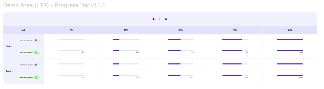
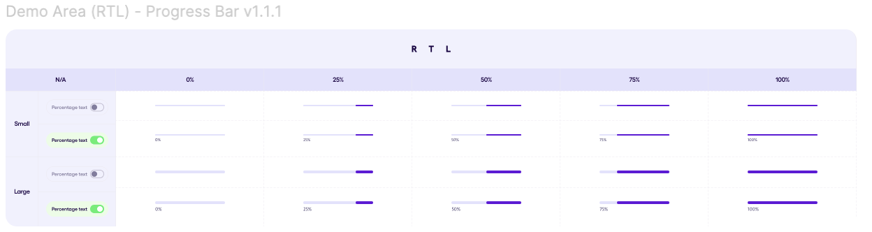
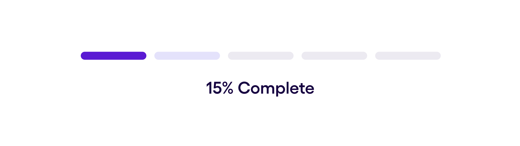
Progress Bar v1.3.0 #
The ProgressBar component displays either a linear or circular progress bar with optional label support. The progress bar can come in five styles:
- Default: Default theme colors
- Secondary: progress bar colors are secondary colors theme
- Positive: positive colors theme is applied
- Negative: negative colors theme is applied
- Warning: warning colors theme is applied
ProgressBar consists of the following elements:
- progress: Float (Required)
- label: String (Optional)
- style: ProgressBarStyle (Optional)
- type: ProgressBarType (Optional)
- size: ProgressBarSize (Optional)
Below you can see the images representing different styles, types and sizes of the progressbar, with and without a label and in LTR and RTL
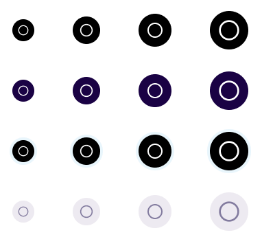
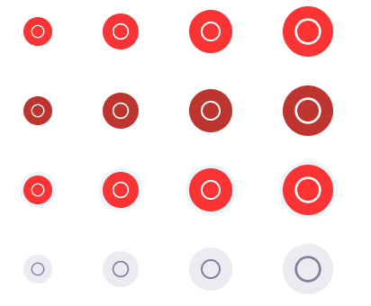
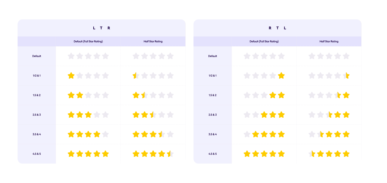
Rating Bar v1.0.0 #
Rating bar allows users to select a rating from 0 to 5 using stars.
The RatingBar supports whole-star and half-star ratings, and updates the rating through user interactions like single and double taps.
Scrollbar v1.0.0 #
The Scrollbar can be drawn using 2 approaches:
- Component
- Modifier
We have 2 orientation:
- Vertical
- Horizontal
We can apply it for:
- LazyRow, LazyColumn, LazyGrid
- BasicTextField
- Column, Row
Components that have already implemented with Scrollbar:
- TextArea.
- Backdrop List type.
Selectors v2.0.0 #
Selectors are used to find or check the appropriate data from the given list. They are divided into two categories:
- RadioButtons
- CheckBoxes
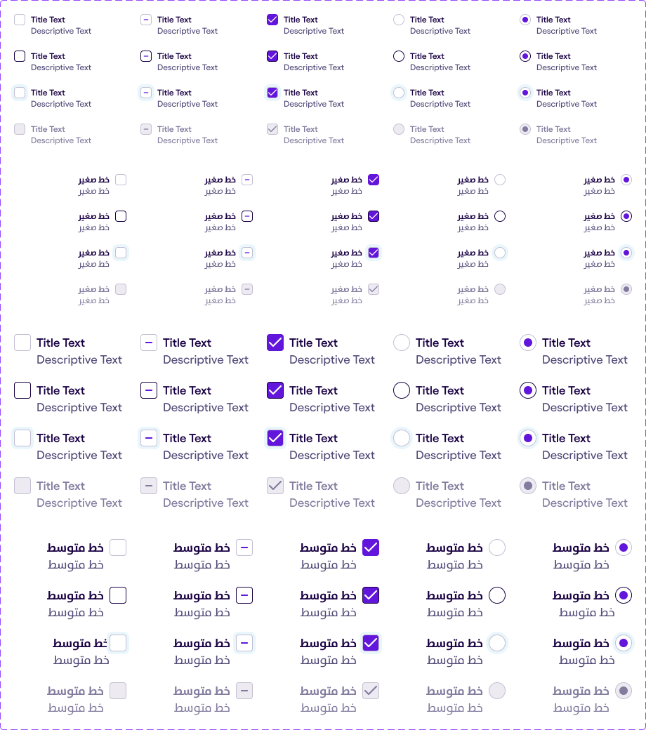
Both of them are consist of:
- Selector
- Title Text
- Description Text
Both Title Text and Description Text are changable and hidable.
4 states are available in the Selectors
- Default
- Hover
- Focus
- Disabled
The following component is available in RTL an LTL.
For the Check Boxes is also presented an Intermediate state which is used for inner lists. The purpose of this state is to show the user that the elements of the inner list are selected but not all of them.
Selection Tile v1.0.0 #
The Selection Tile is a flexible, content-rich container designed to present items, services, or categories. It supports visual, textual, and interactive elements — such as images, tags, and checkboxes — making it ideal for selection and comparison scenarios.
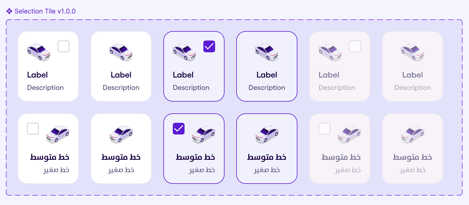
Selection Tile is consist of:
- Selector
- Label Text
- Description Text
Both Label Text and Description Text are changeable. While Selector is changeable or hideable
3 states are available in the Selectors
- Default
- Selected
- Disabled
The following component is available in RTL an LTL.
Skeleton (Shimmer Layout) v1.1.0 #
The Skeleton with Shimmer Layout is usually used when content is Loading. This comes in sefar as a modifier and you can apply it to any component, specifying its shape and size. Shapes can be Circular, Rectangular, or List Item.
Note: The animation of the shimmer works from left to right in LTR mode and from right to left in RTL mode.
Circular & Rectangular Shapes’ Skeletons
List Item Shape Skeleton
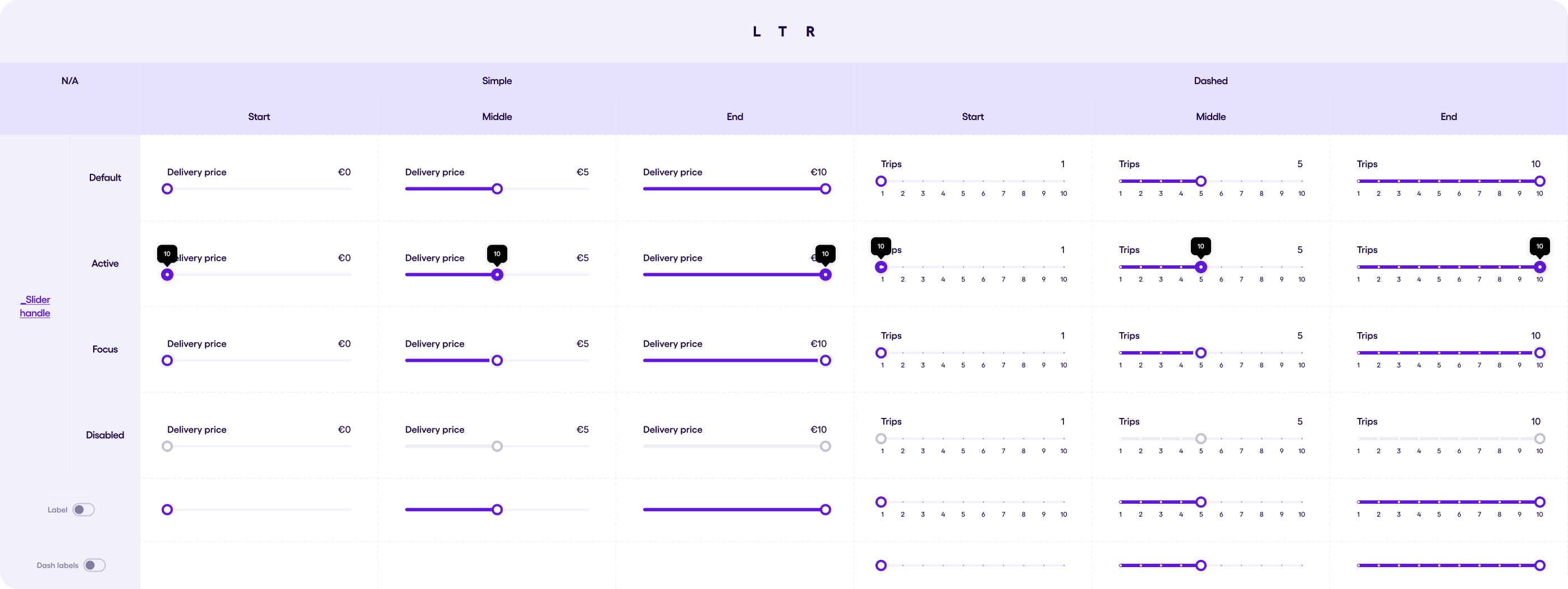
Slider v1.0.1 #
The slider component helps the user to select a value from a certain range of values with a minimum & a maximum.
The Slider component has two types :
- Simple slider
- Dashed slider with ticks
Each type of the two has a Label of the chosen value (Optional). The Dashed slider has the dash labels property (Optional).
The slider has 4 different styles according to the states :
- Default
- Focused (when the slider handle can is tapped)
- Active (the sliding state when the user taps and holds)
- Disabled
In the image below you can see the variants in LTR and RTL.
Snackbar v2.0.0 #
The Snackbar component provides a flexible way to display brief, temporary messages at the bottom of the screen. It can include one or two actions and an optional icon.
-
Message: A text message to inform the user of an action, event, or process. The message is a required attribute of the component.
-
Actions: The snackbar can have 2 actions, both optional. An action is a Text Button that allows the user to take immediate action in response to the message (e.g., “Undo” or “Retry”).
-
Icon: An optional icon can be displayed on the left side of the message for added visual context.
-
Auto-Dismiss: The Snackbar automatically disappears after a specified time interval (default is 5000ms), the snackbar will also dissapear after the user performs one of the actions.
In the image below you can see the variants in LTR and RTL.
Steppers #
Stepper v1.0.0 #
The Stepper component is a visual navigation guide that indicates the progress of a multi-step process. It allows users to track their progress and understand the completion status of each step.
Usage: Use steppers to break down complex processes into digestible steps, guiding users through the workflow. Steppers are commonly used in onboarding flows, checkout processes, wizards, and other multi-step forms.
Anatomy:
- Step Label: Text that describes the purpose of each step.
- Step Indicator: A visual element that represents the state of each step (e.g., circle, number).
- Connector Line (Optional): Visual line connecting the steps to indicate the flow.
- Description (Optional): Text providing additional details about each step.
Variants:
-
Style:
With Icons: Uses icons to represent each step. With Numbers: Uses numbers to represent the order of each step.
-
Layout:
Vertical: Stacks steps vertically, suitable for limited horizontal space. Horizontal: Arranges steps horizontally, ideal for displaying the entire flow at once.
-
State (for each step):
Remaining: Indicates a step that the user has not yet completed. Current: Highlights the current step that the user is actively engaged with. Completed: Indicates a step that the user has successfully finished. Error: Indicates a step with an error that needs to be addressed.
-
Show/Hide Description: Option to display or hide the descriptive text below each step label.
-
Change Icon (Icons style only): Property that allows customization of the icon for each step (if using the “with icons” style).
-
Spacings:
The recommended spacing between steps and other elements depends on the chosen layout and the complexity of the content. efer to the Sefar Design System spacing guidelines for general recommendations.
-
Behavior:
Stepper interaction might vary depending on the implementation, but it typically allows users to navigate between steps or view detailed information about each step. The current step should be visually distinct from other steps to indicate progress. Consider providing informative feedback and error messages for incomplete or erroneous steps.
-
Dos and Don’ts:
Do: > Keep step labels concise and clear, avoiding ambiguity. > Use consistent visual styles for all steps throughout the process. > Provide clear feedback on the interaction and state changes of the stepper.
Don’t: > Overload the stepper with too many steps, as it can overwhelm users. > Use vague or unclear labels for each step. > Design the stepper in a way that hinders user navigation through the process.
The below image showcases LTR and RTL variations of Stepper and its subcomponents.
Progress Stepper v1.0.0 #
The stepper progress component indicates the progress of the user on a certain flow.
The stepper progress has multiple “Progress Tabs”. Each of the progress tabs has 3 states:
- Current
- Remaining
- Completed
Each of the progress tabs has 2 sizes as well:
- Small
- Medium
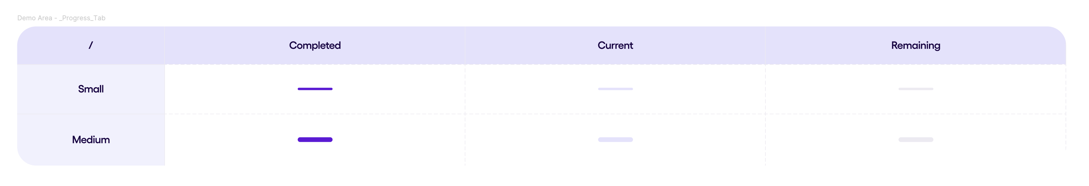
The stepper progress has up to 5 steps in total, it also has an optional Label.
Switches v1.1.0 #
A switch toggle (also known as a toggle switch or Switch widget) is a common UI element in Android applications that allows users to control various settings and features within an app.
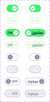
4 states are available in switches
- Default (Inactive)
- Active disabled
- Active
- Disabled
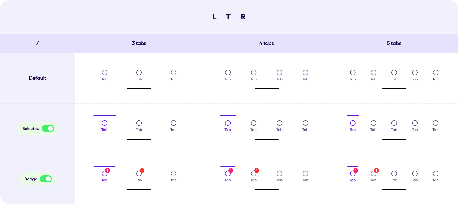
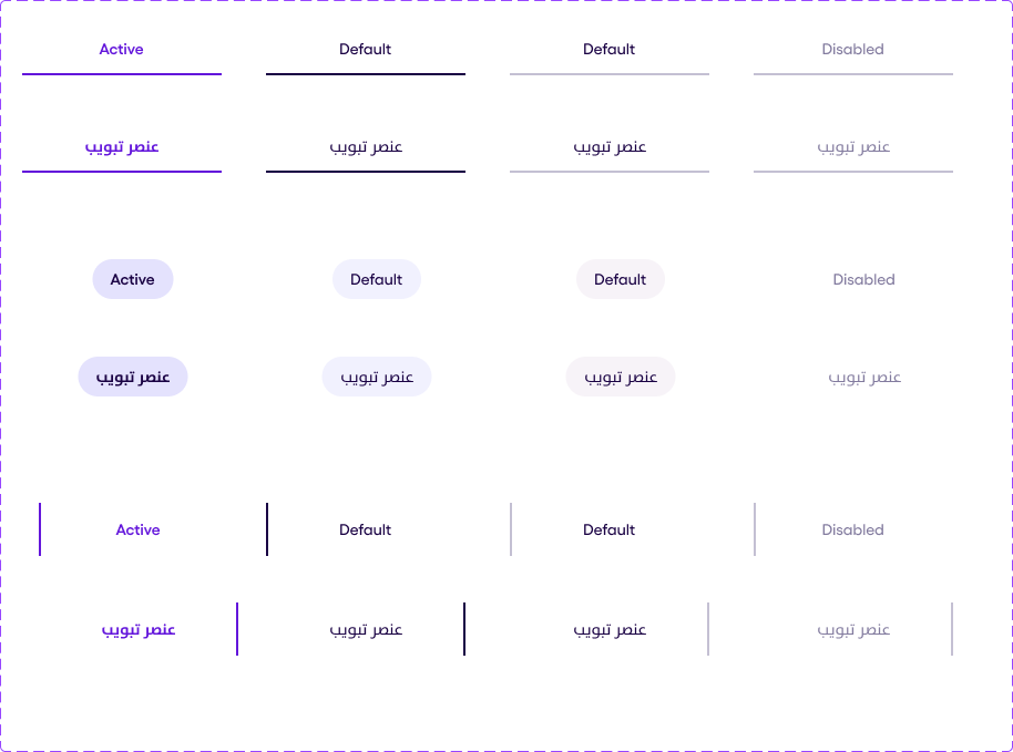
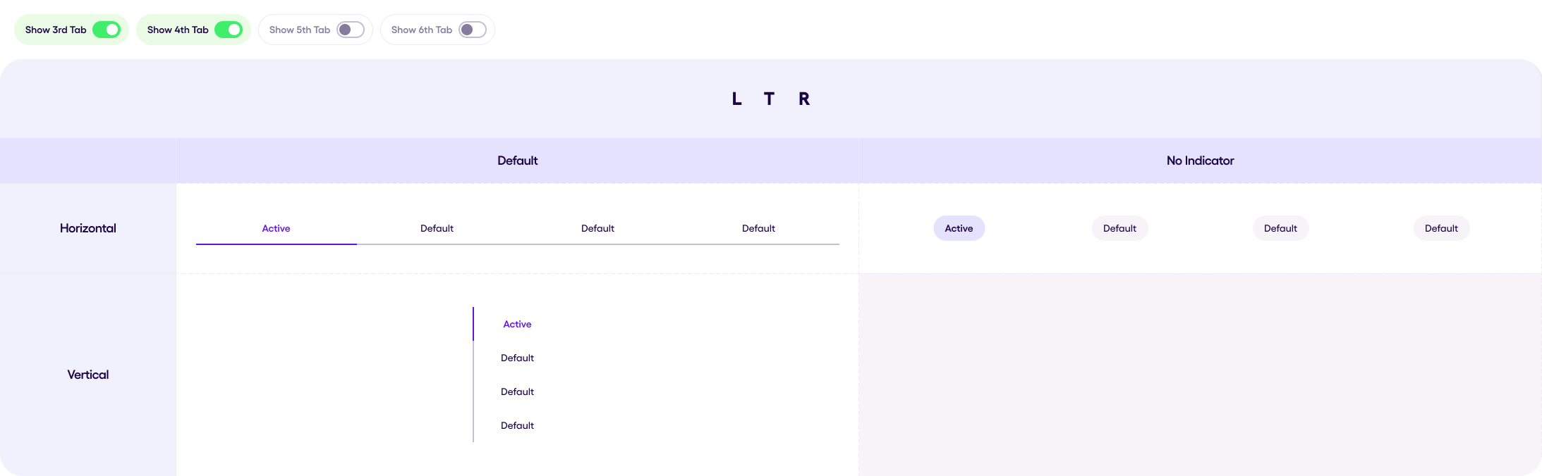
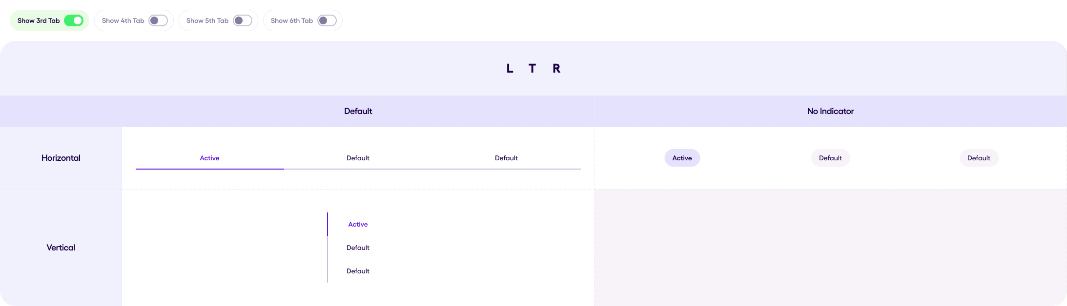
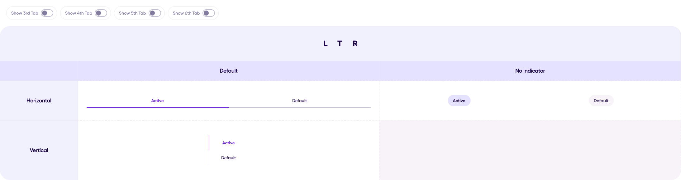
Tabs v1.3.0 #
Tab element can be presented in 3 different stages:
- No Indicator
- Default Horizontal
Default Vertical Tabs is curretly not supported.
No Indicator tag has 4 states:
- Active = when the element is chosen
- Hovered = when the element is pressed on
- Default = general state of the element
- Disabled = the element does not response to any actions
Default tab stages is supported by the material3 library.
The visual part of each of this state presented in the following image
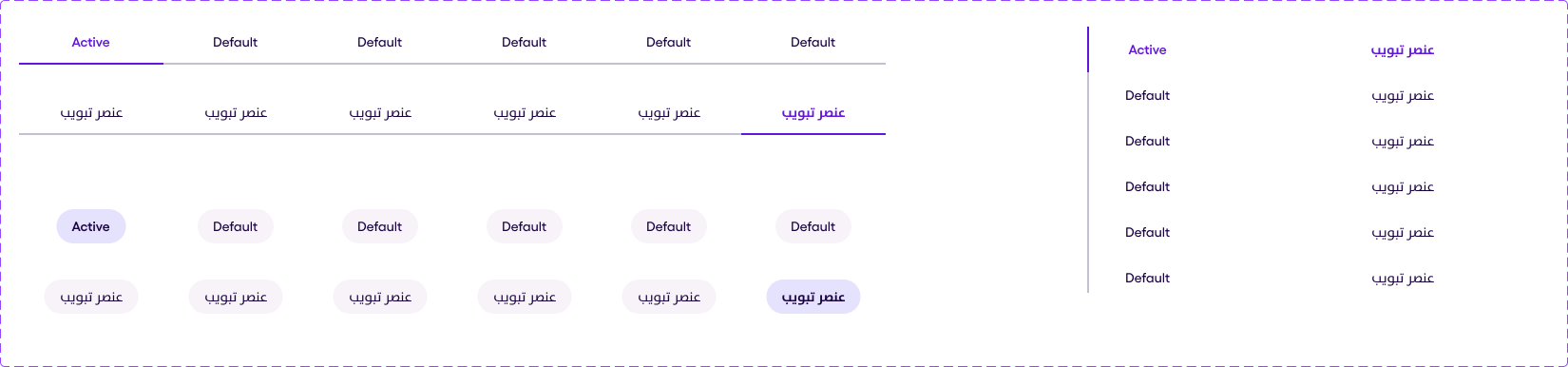
Tabs Component constits of several tab elements. Minimal amount of the tabs in the component is 2. Maximum is 6 tabs. Tabs, which is presented as null will not be displayed.
The following image shows an example of the tabs component in the all 3 modes with 6 elements each.
 The following image shows an example of the tabs component in the all 3 modes with 5 elements each.
 The following image shows an example of the tabs component in the all 3 modes with 4 elements each.
 The following image shows an example of the tabs component in the all 3 modes with 3 elements each.
 The following image shows an example of the tabs component in the all 3 modes with 2 elements each.
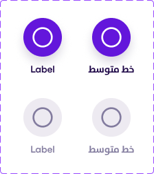
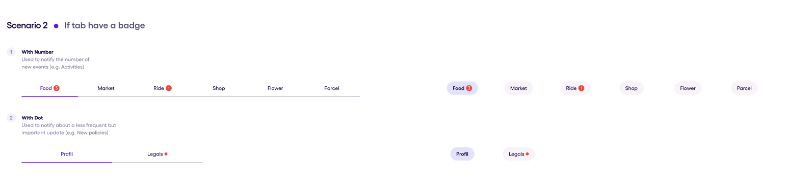
 Also in the tabs can be presented a badge, which can be presented in two types:
- With Dot
- With Number
The examples of the badges in the tabs presented in the following image:
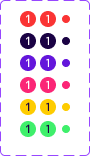
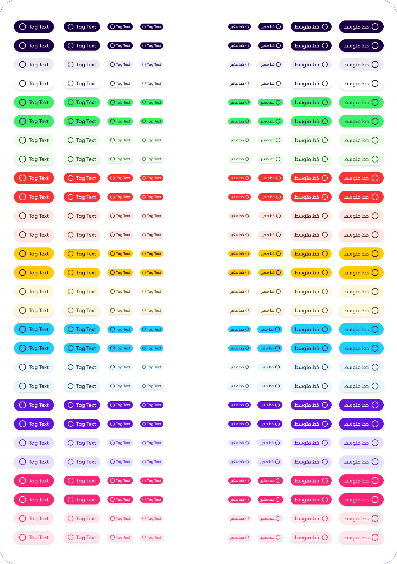
Tags v1.3.0 #
Below you can see LTR and RTL demonstrations of the Tag component in its different styles
- Neutral
- Positive
- Negative
- Warning
- Informative
- Primary
- Secondary
Note that each style comes in 2 variations:
- Default
- Alternative
A Tag can have both Text and Start icon or only one of them (i.e. only icon or only text). You can use Tags in fours sizes:
- Small
- Medium
- Large
- Extra Large
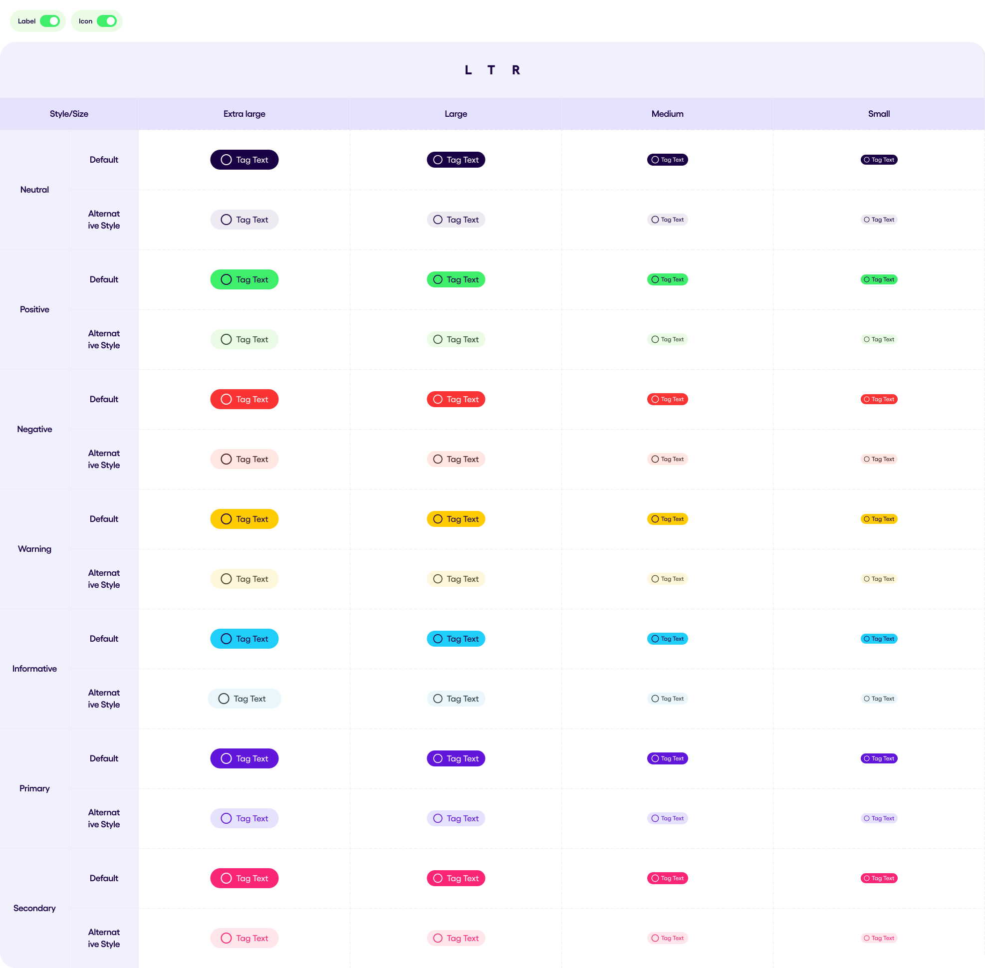
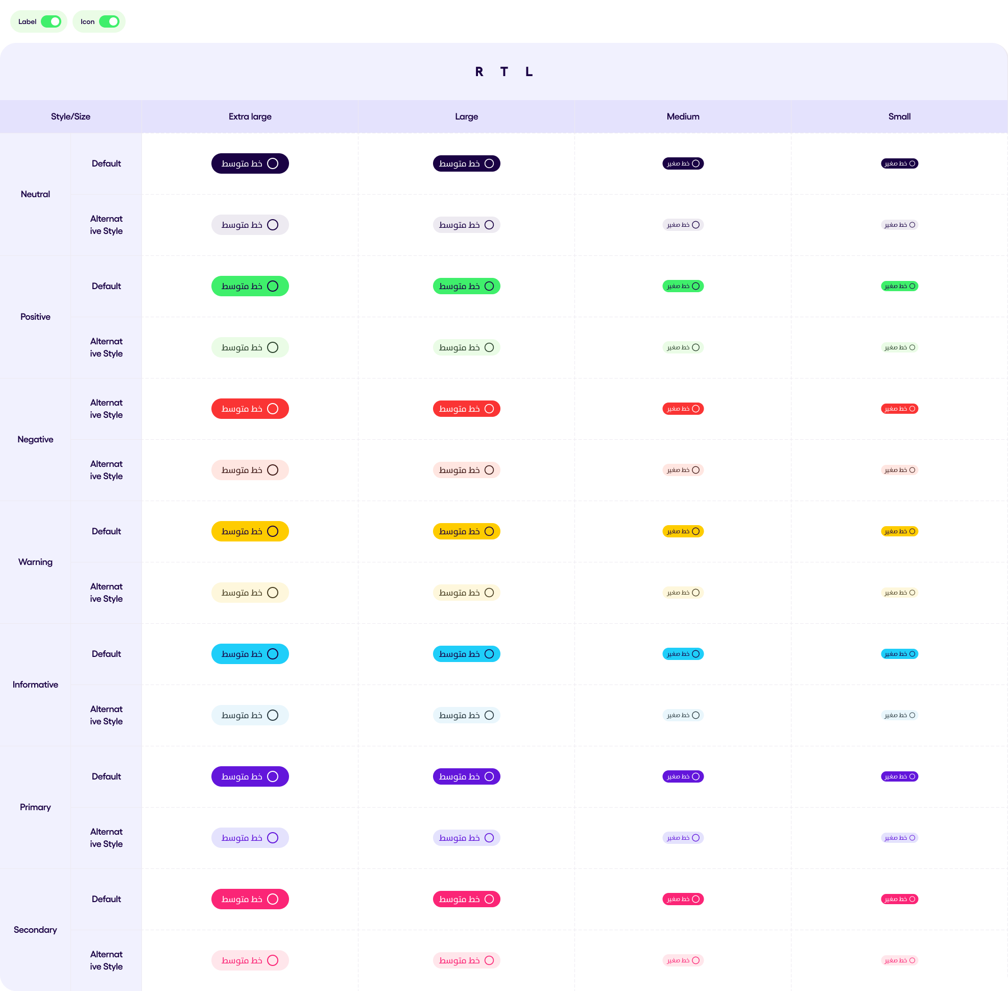
You can choose whether your Tag is elevated or not and here are the variations and how they will look like when elevated.
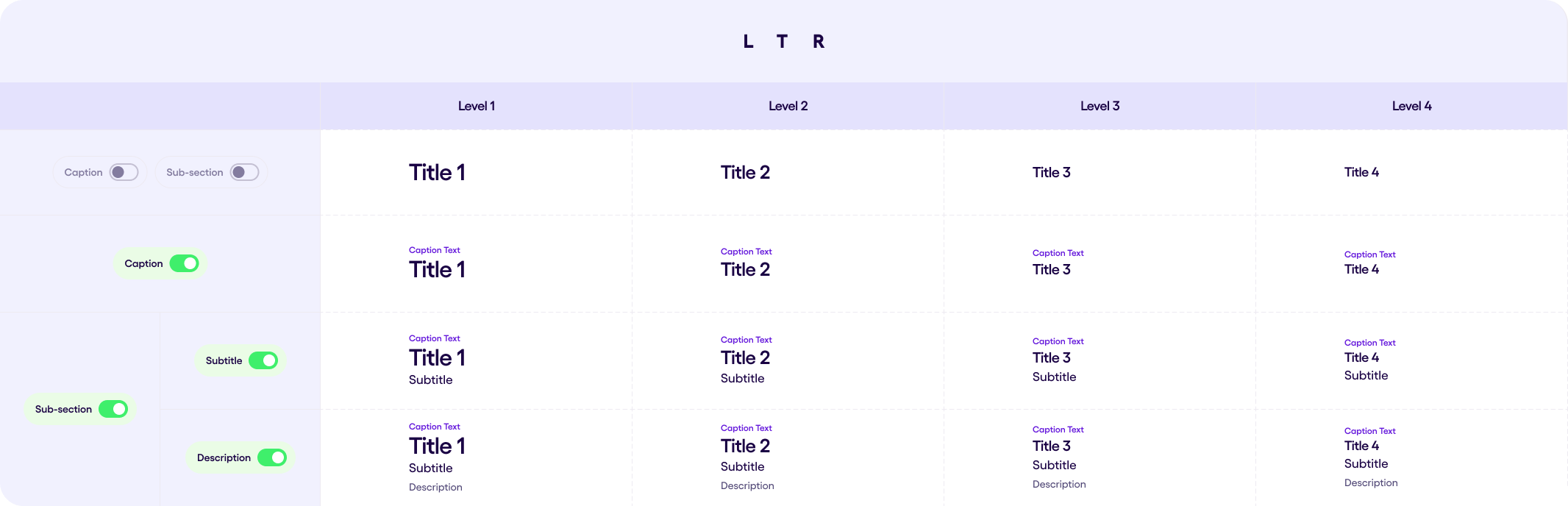
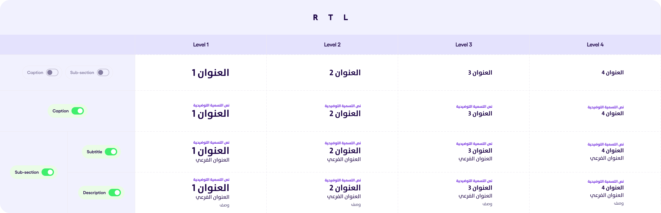
Titled Section v1.1.0 #
Below you can see the Titled Section Demoed in both LTR and RTL Directions.
- Caption
- subtitle
- description
are all optional properties, wheras title is a mandatory one.
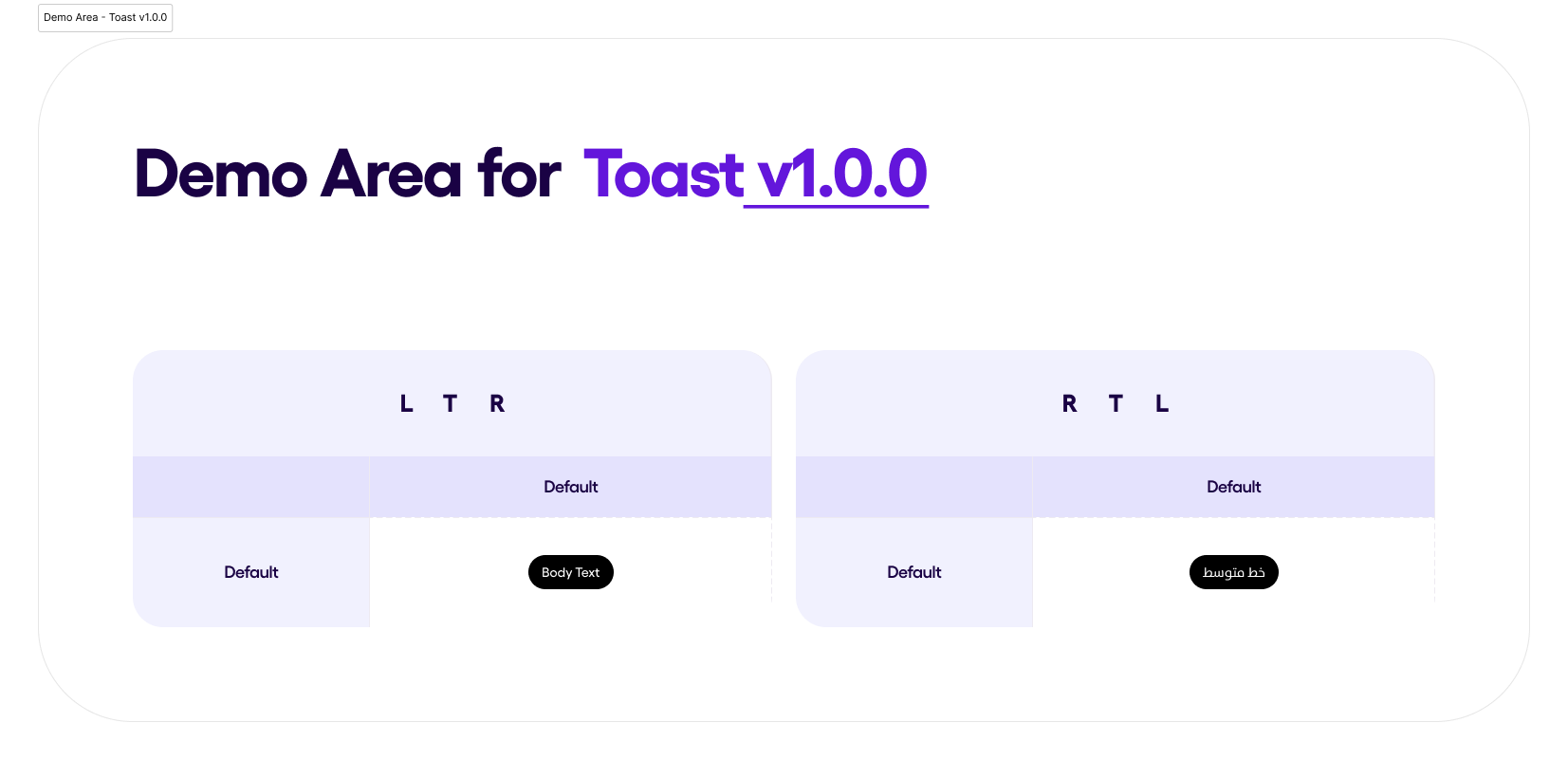
Toast v1.0.0 #
A small, non-intrusive message that pops up on the screen to provide feedback to the user. It automatically disappears after a short duration and does not require user interaction.
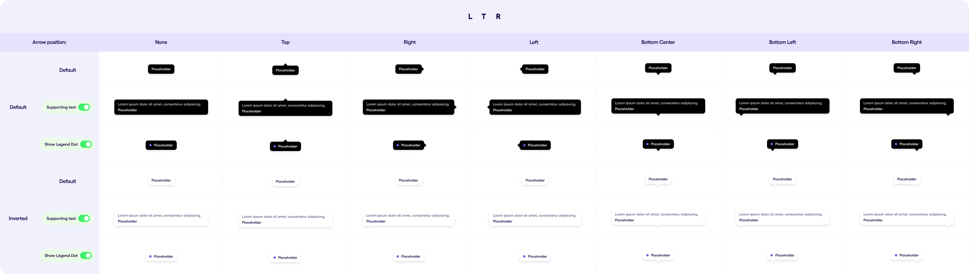
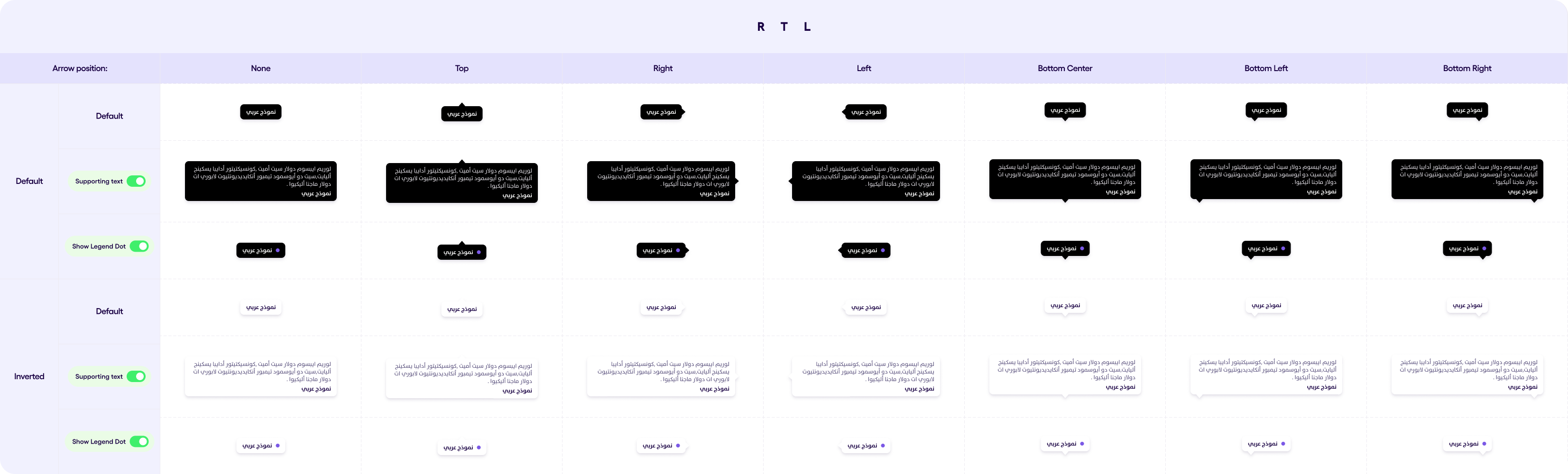
Tooltip v1.2.0 #
The Tooltip component displays a tooltip with optional supporting text, a directional arrow, and an optional colored dot. It also supports an inverted color scheme for better contrast or alternative styling.
Tooltip consists of the following elements:
- Text (Required)
- supportingText(Optional)
- arrow (Optional)
- dot (Optional)
- close icon (Optional)
Below you can see the images representing different states of the tooltip in LTR and RTL
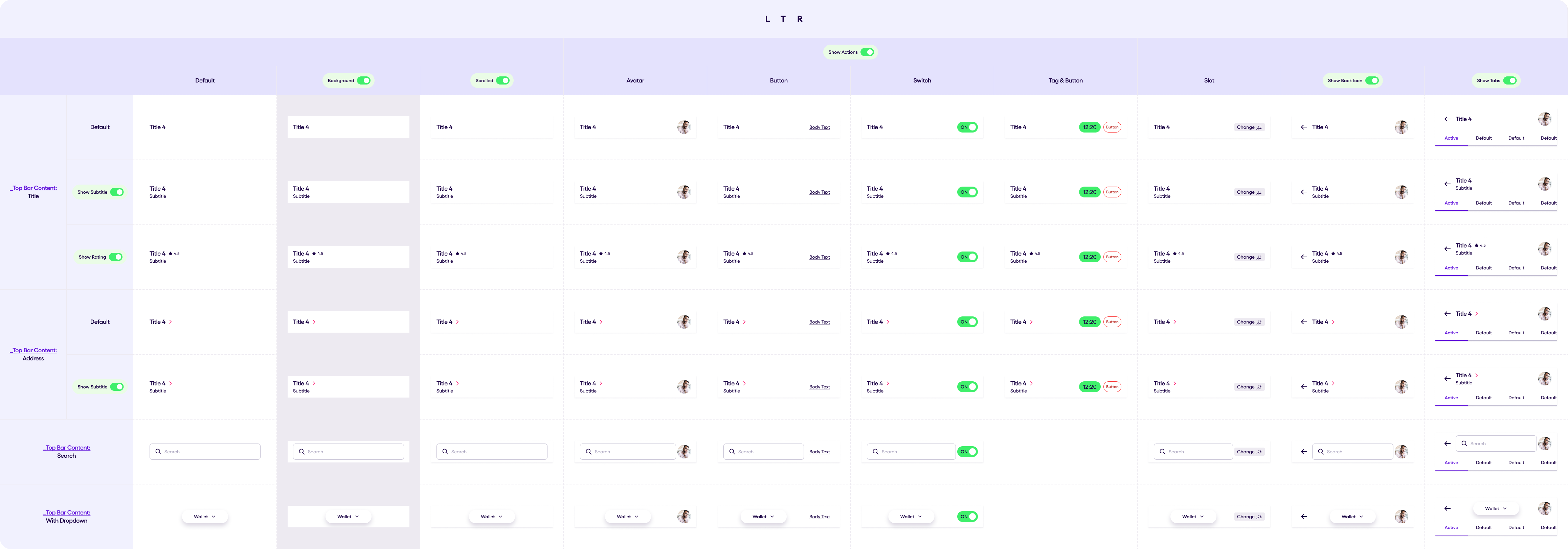
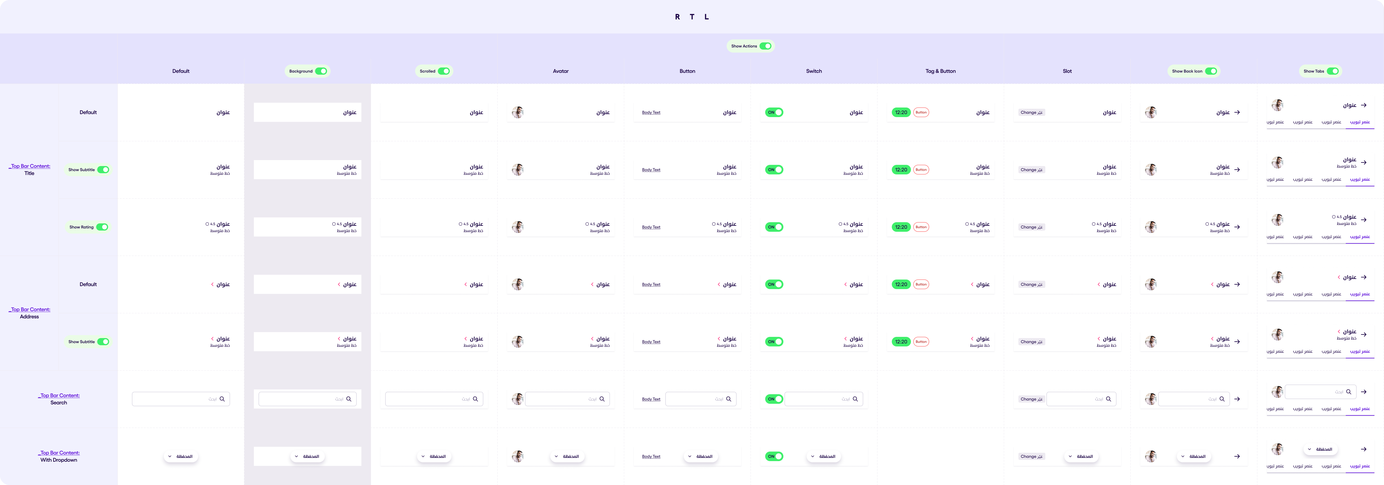
Top Bar v1.5.0 #
Top Bar is a component which is used to be presented on the top of the screen and navigate actions. It consists of 5 different parts:
- Leading Icon
- Leading Avatar
- Top Bar Content
- Top Bar Actions
- Tabs
Leading Icon is always an arrow left icon which can be shown or hidden. Top Bar Content is the middle part of the Top Bar and can be present as one of the the next components:
- Title
- Address
- Search Input
- With Dropdown
Title Content consists of an Avatar, Title can have an optional Subtitle. It can also have a rating icon and rating value.
Address Content is similar to the Title Conponent, the only difference they have is that the Address Content has an Address Icon Arrow presented instead of rating. This arrow is mandatory and can not be hidden.
Search Input is a just normal Search Input Field. DropDown is a button with an action in which consumer can put the action he’d like.
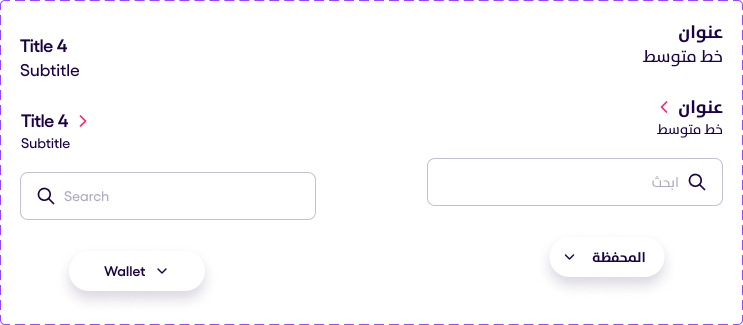
Top Bar Actions can be one of the following:
- Avatar
- Texual Button
- Actions Bar
- Switch
- Slot
Actions Bar is a list of 1-3 clickable icons. It is possible to set only one, two or whole three elements.
Slot is an empty @Composable to give the consumer to create his own Top Bar Action.
Tabs are optional and both types can be applied here(Default and NoIndicator). Tabs can scroll horizontally.
Topbar have an optional elevation that can be used when scrolling to show that its above content.
Others components are the regualr ones.
Also Top Bar can has a regular background or the background can be transparent.
The visual representation of the Top Bar variations are presented below: